
AI Typography Generator
For most of the last few years, letters were the thing image models could not do. You asked for a word and got a shape that resembled writing from across the room and fell apart up close. That has changed, and accurate text is now the headline capability of the model behind this AI typography generator. Give it one word and pick a treatment — glossy chrome, gold foil serif, neon sign, brush script, retro seventies or Swiss minimal — and it comes back in about twenty seconds at up to 4K as finished lettering artwork, complete with the material, the lighting and the surface the letters live on.
Try It Now — Free
Pick the lettering treatment first, then put your word in the details box — one short word in capitals gets the most reliable result. Every preset already carries the instructions that decide whether letters come out clean: one word only, spelled out letter by letter, level baseline, even spacing, and nothing else competing for the frame.
AI Typography Generator
Pick a lettering style, type your word, and get finished typography artwork at up to 4K
Lettering From the AI Typography Generator
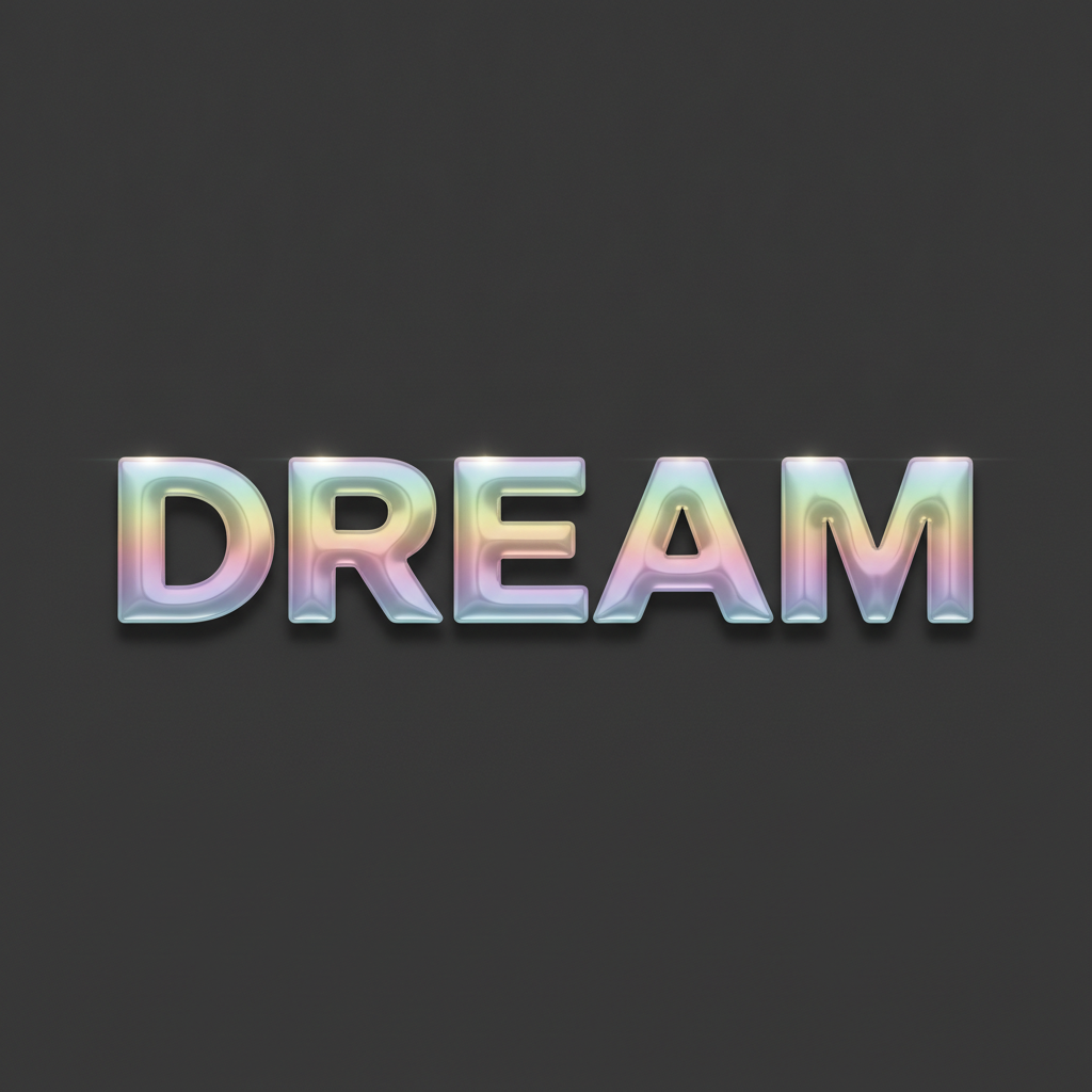
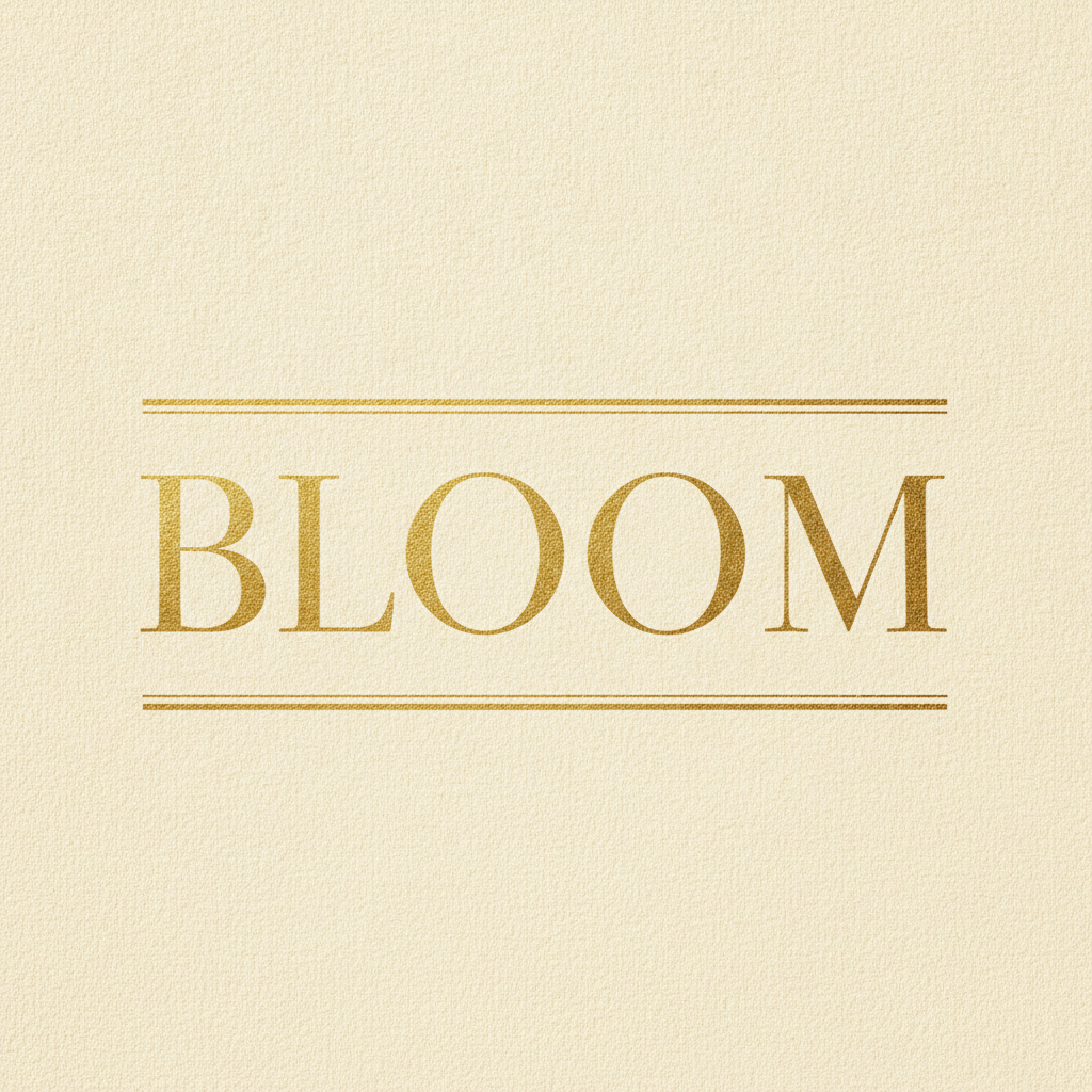
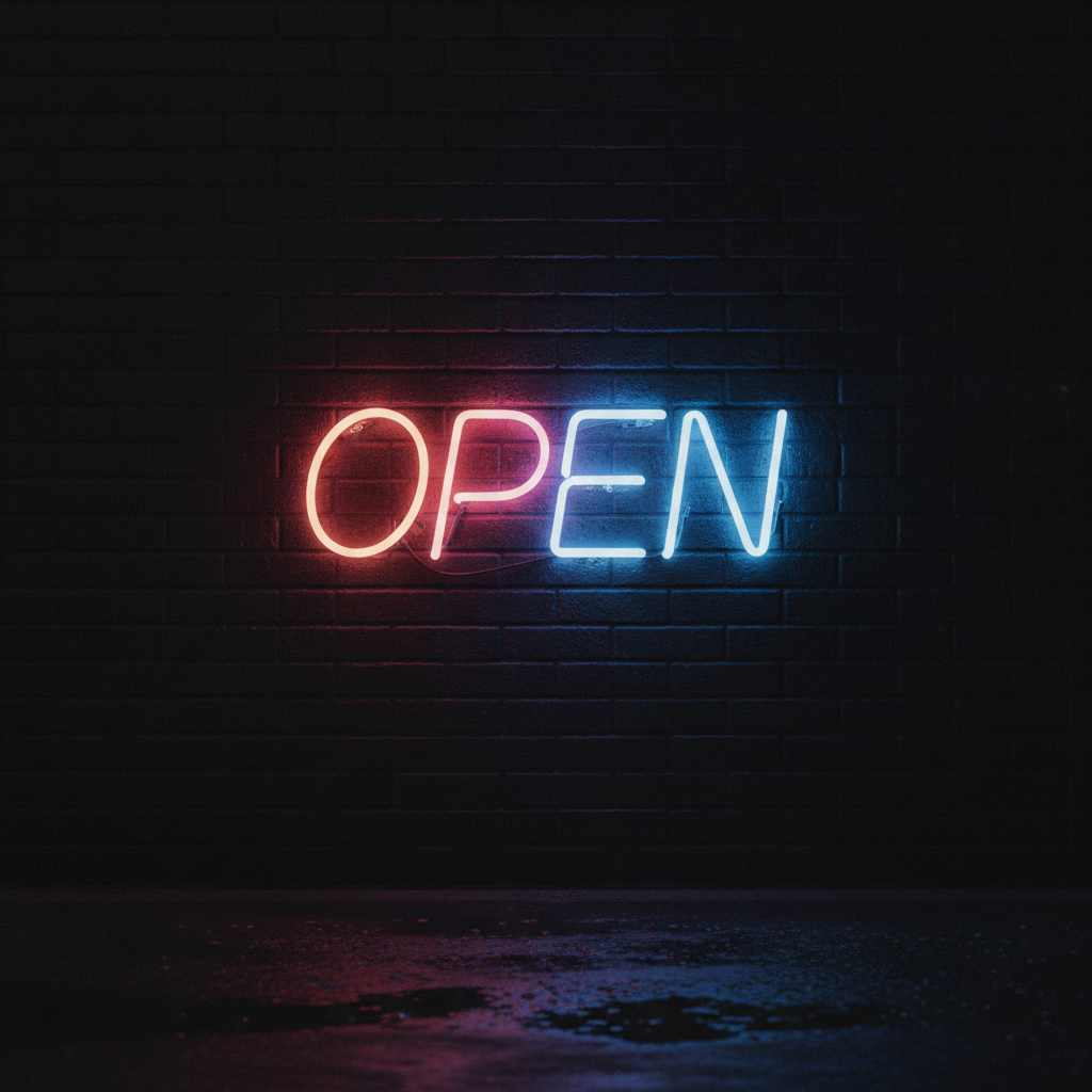
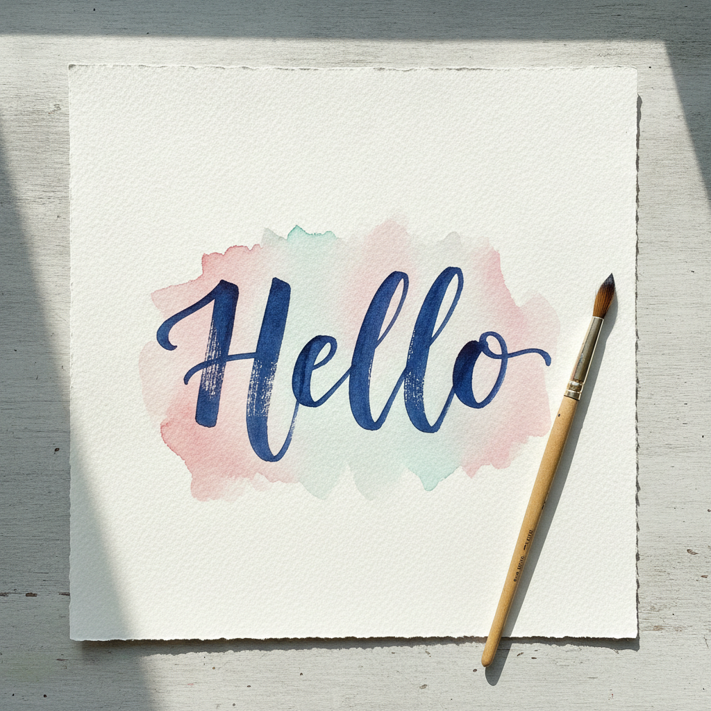
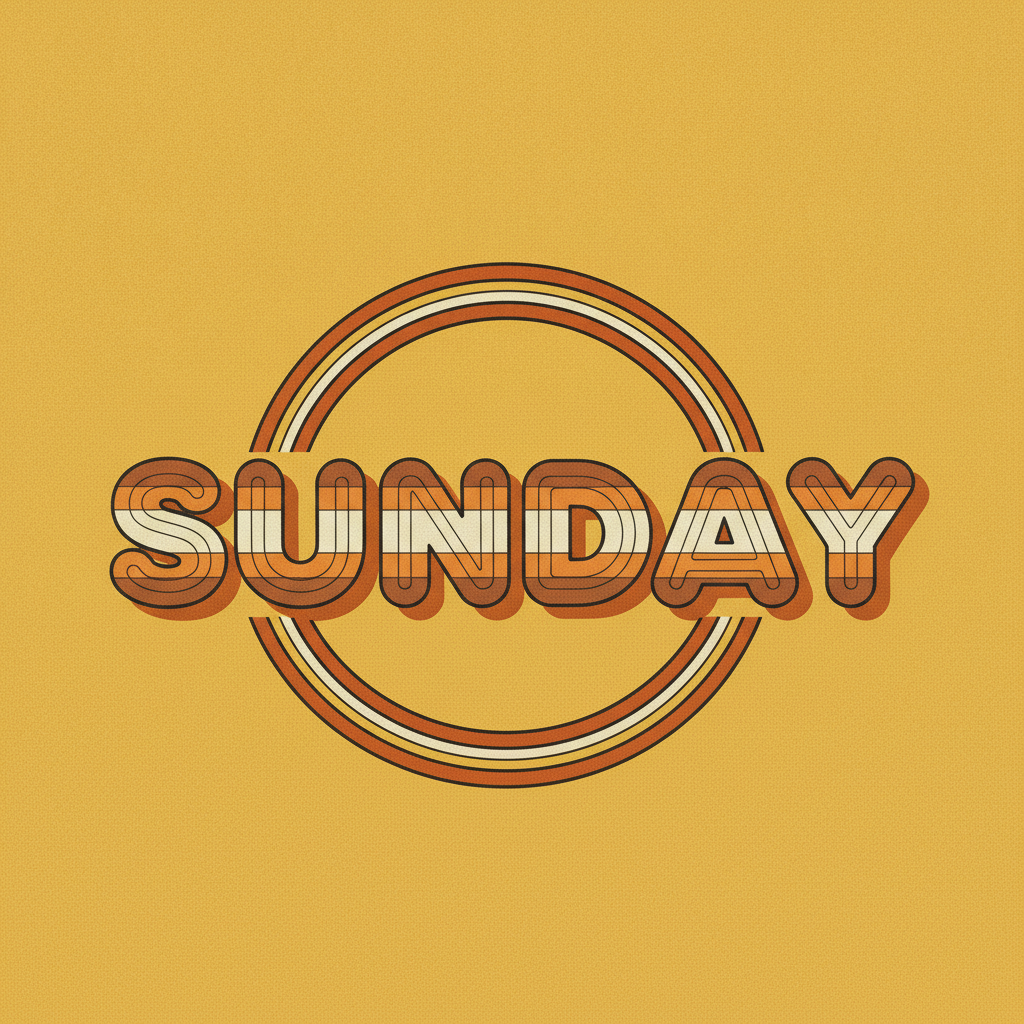
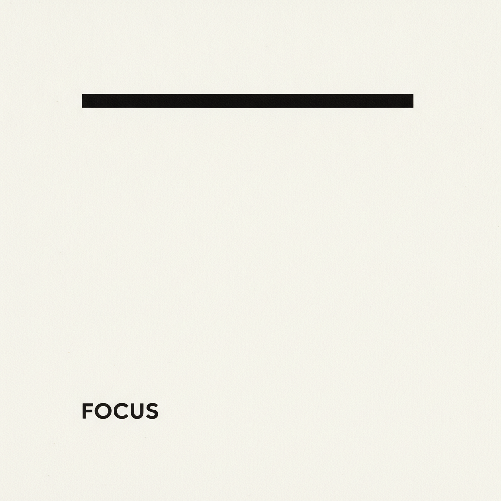
Glossy chrome, gold foil serif, neon sign, brush script, retro seventies and Swiss minimal — six treatments that cover most of what a single word is ever asked to do
How the AI Typography Generator Works
Three steps from a word to lettering artwork you can put in front of a client
Give It One Short Word
Length is the single biggest predictor of whether generated lettering comes out clean, and it is the one variable entirely under your control. A four to seven letter word in capitals is the sweet spot: DREAM, BLOOM, OPEN, FOCUS, SUMMER, ESCAPE. Every additional character is another chance for a letter to be doubled, dropped or subtly malformed, and the failure rate climbs steeply past about ten characters. Two-word phrases are possible but roughly halve your hit rate; a full sentence set as display type is still a coin toss. Common English words beat invented ones, because the model has seen them written thousands of times, which is why a made-up brand name or an unusual surname is harder to render than a longer but ordinary word. Prefer capitals to lower case, since caps have simpler shapes and no ascenders or descenders to collide. And type the word into the details box exactly as you want it, in the case you want it — do not describe it, state it.
Pick the Treatment, Then the Surface
The presets are not just colour schemes. Each one carries a letterform, a material and a lighting setup, because those three things are what actually make a piece of typography read as chrome, or neon, or letterpress. Glossy chrome wants heavy extended capitals on a dark ground so the reflections have somewhere to fall. Gold foil wants a high-contrast serif with hairline strokes and a textured paper to deboss into. Neon wants continuous tubing, which is why rounded letterforms work and sharp angular ones break. Brush script wants a thick downstroke and thin upstroke and a paper that shows the water. Retro seventies wants fat rounded caps with enough interior room to hold horizontal colour bands. Swiss minimal wants condensed grotesque capitals set small against a lot of empty space, because the emptiness is the design. Pick the one closest to your brief, then use the details box for your word, your palette and your background — those override cleanly without breaking the style.
Proofread Every Letter at Full Size
This step is not optional and it is the one people skip. Open the result at full resolution and read the word character by character, not as a shape — the eye completes familiar words automatically, which is exactly how a doubled letter or a dropped one survives three rounds of review and reaches print. Check the count first, then each letterform in isolation, then the spacing, because uneven kerning around one pair is often the tell that a letter was reconstructed. If something is wrong, regenerate rather than argue with the prompt; a fresh pass is faster than a correction and the model is not editing an existing image. Once the word is right, the file is a flat raster image at up to 4K, so decide what you are using it for: a social post, a thumbnail or a poster comp can go straight out, while anything that needs to scale infinitely, sit in a layout as live text, or carry a legally exact name should be rebuilt with a real font in a design tool using this as the reference.
Why Use an AI Typography Generator
Six things worth knowing about generated lettering before you put it in a layout
Letters Are the Hard Part, and They Now Work
Text was the standing joke of image generation. Every model until recently produced letterlike marks — the right rhythm, the right density, the wrong everything else — because a diffusion model is trained to reproduce the statistics of an image rather than a discrete sequence of symbols, and there is nothing in that objective that says the third character must be an E and not something E-shaped. The current generation gets it right for short strings a large share of the time, which is a genuine capability shift rather than a marketing claim, and it is the reason a typography tool built on an image model is worth using at all. What has not changed is the shape of the failure. It is still probabilistic rather than deterministic, it still degrades with length, and it still fails silently, producing a beautiful image with a wrong letter in it. Design your process around that: short words, a real look at the output, and a regenerate rather than a patch.
You Get Artwork, Not a Font
This is the distinction that decides whether generated lettering fits your job. A font is a system: a full character set, spacing rules, kerning pairs and outlines you can set any text in, at any size, forever. What comes out of an AI typography generator is a picture of one word, once. You cannot type a different word in it, you cannot scale it past its pixel dimensions without losing edges, and you cannot hand it to a developer as a webfont. That sounds limiting until you notice how much design work needs exactly one word, treated richly: a hero image, an album cover, a thumbnail, a poster, a T-shirt front, a title card, a sticker, a logotype comp for a client meeting. For those, a rendered word with real material and real lighting is worth more than a font file, because reproducing chrome, neon or foil convincingly from a plain typeface is hours of work in a design tool. Use it where the word is the image, and use a font where the words are content.
Short Words Beat Long Ones, Every Time
The reliability curve is steep and knowing where it bends saves most of the frustration. Four to seven characters in capitals is comfortable territory. Eight to twelve still works but wants a second look and sometimes a second generation. Beyond that, and particularly with two or more words, the odds of a clean render fall off quickly, and technical terms, invented brand names, foreign-language words and anything with unusual letter pairs are harder than their length suggests because the model has less prior experience of the string. Numbers and punctuation are weaker again. There are three practical workarounds. Generate the main word here and set any supporting line in a real typeface afterwards, which is what most professional workflows do anyway. Split a phrase across separate generations and compose them. Or accept the comp as a comp — get the look approved, then rebuild the type properly. What you should never do is send a long generated string to print without reading it letter by letter first.
The Material Is Doing Half the Work
Ask most people to name a piece of typography they love and they will describe a surface rather than a letterform: the glow of a neon sign, the deboss of gold foil on heavy stock, the chalky bleed of a screen print, the wet shine of chrome. That is the part a design tool makes expensive and an image model makes cheap. Rendering convincing foil means simulating a metallic sheen that shifts along the stroke; convincing neon means a core, a halo and light spilling onto the wall behind; convincing letterpress means an impression with a shadow inside it. Each is an afternoon of layer styles for a designer and a phrase in a prompt here. So write prompts that name the physical situation, not just the aesthetic: the material the letters are made of, the surface they sit on or in, the light hitting them and the time of day. Style words alone give you a flat approximation; material and lighting give you the photograph.
Legibility Is a Design Decision, Not a Setting
Generated lettering inherits every classic typographic trap, and the model will happily walk into all of them because it is optimising for a plausible image rather than for reading. Low-contrast letters on a busy background look sophisticated on screen and vanish on a phone. Very tight tracking on heavy display caps closes the counters and turns words into texture. A gradient running through a word can drop a stroke into the background at exactly the wrong point. Script faces with elaborate flourishes are the worst offenders, because the decoration and the letterform compete and the reader loses. The fixes are the ordinary ones. Keep real contrast between the letters and whatever is behind them. Give heavy capitals room to breathe. Test the result at the size it will actually be seen — a thumbnail is about a hundred pixels wide in a feed, not the twelve hundred you are looking at. And if a word has to be read rather than admired, choose the simpler treatment.
Free to Start, $9.98 to Go Further
You can generate typography free without a credit card, which is enough to find out whether a word renders cleanly and whether a treatment suits the brief before anyone pays for anything. Paid plans start at $9.98, and that is where the real work happens, because usable typography is almost always the third or fourth pass rather than the first — you regenerate to fix a letter, to try the same word in two treatments, to test a palette, or to build a matching set of titles for a series. Output reaches 4K without a watermark and is cleared for commercial use, which covers client work, merchandise, book and album covers, thumbnails and paid social. Set that against the alternative: a custom lettering commission runs from a few hundred to several thousand dollars and takes a week or more, and a premium display font licence for commercial use is rarely cheap either. Neither is replaced by this — but deciding what you want before you commission it gets a great deal cheaper.
Frequently Asked Questions
Common questions about using an AI typography generator
Set the Word in Twenty Seconds
Pick a treatment, type one short word, and get finished lettering artwork at up to 4K — chrome, gold foil, neon, brush script, retro or Swiss minimal. Powered by Nano Banana Pro. Free to start, plans from $9.98.
When the Word Is the Image: the AI Typography Generator
Typography used to be the clearest line between what image models could do and what they could not. They could paint light, skin, weather and metal convincingly, and then fail at five letters in a row. The reason was structural rather than incidental: a diffusion model learns to reproduce the statistics of an image, and nothing in that objective insists that the third mark in a word be an E rather than something E-shaped. That has genuinely changed in the current generation, which is why an AI typography generator is now a useful tool rather than a novelty. Short strings come back correct a large share of the time, complete with the material and lighting that make display lettering expensive to produce by hand — the sheen travelling along a foil stroke, the halo and wall-spill of a neon tube, the wet highlight on chrome, the bleed where a loaded brush meets watercolour paper.
The six treatments here exist because those are the situations where one word has to carry an entire design. Glossy chrome and retro seventies are the loud ones, built for covers, merchandise and thumbnails that need to survive being seen at two inches wide. Gold foil serif is the restrained luxury register used by beauty, weddings and stationery. Neon is atmosphere as much as lettering, which is why the wet ground and the glow on the bricks matter more than the letterforms. Brush script is the handmade voice, and the only preset where the imperfection is the point. Swiss minimal is the opposite argument — small condensed capitals in a lot of empty space, where the restraint does the talking. Between them they cover most briefs that begin with a single word and a feeling.
Two habits get you most of the way. Keep the word short, in capitals, and ordinary — four to seven characters is the comfortable range, every extra character raises the odds of a dropped or doubled letter, and an invented brand name is harder than a longer familiar word. And describe the physical situation rather than the mood: what the letters are made of, what surface they sit on, what light is hitting them and from where. Style adjectives alone produce a flat approximation of a look. Material and lighting produce the photograph of it.
What the AI Typography Generator Will Not Do
It will not give you a font. There is no character set, no kerning table and no outline file at the end of this — only a flat raster picture of the one word you asked for, which cannot be re-typed, cannot scale indefinitely and cannot be handed to a developer as a webfont. It will not reliably set long strings either: past roughly a dozen characters, or across two or more words, silent errors get common, so anything longer should be generated as a comp and rebuilt with a licensed typeface in a design tool. And it will not reproduce a specific commercial font or an existing brand wordmark — the first because it approximates rather than copies, the second because trademarks make it a bad idea regardless of how well it works. For any lettering that sits inside a wider illustration, text in images covers what the model can reliably set.
For the neighbouring jobs there are better fits. Lift finished lettering off its background with the AI background remover before compositing it into your own layout, and enlarge it for print with the 4K image upscaler. When the word is really a mark, the AI logo generator is built for that brief. When it belongs to a format, the AI poster generator, the AI book cover generator, the AI thumbnail generator and the AI banner generator handle the whole composition. To put a word on a product, the AI t-shirt design generator and the AI mockup generator take it the rest of the way.
Within those limits the work is yours to use. Output reaches 4K with no watermark and is cleared for commercial use, which covers client campaigns, merchandise, book and album covers, packaging, paid social and print-on-demand listings alike. Keep other people's property out of it — brand wordmarks, team lettering, film and game title treatments, licensed characters, and the style of a specific named living artist. Check the AI policy of whichever marketplace you sell through, and know that in the United States purely AI-generated images are not registrable for copyright, so selling the work is fine but stopping an imitator may not be. It is free to start with no credit card and plans begin at $9.98. Pick a treatment, type one word, and read every letter before it ships.
Try the AI typography generator free today. Pick one of six lettering styles, type your word, and get finished typography artwork at up to 4K. No credit card required to start. Paid plans from $9.98.