
AI Wall Clock Design Generator
A wall clock is the only thing you will ever design that has two opaque bars sweeping across it forever, a hole drilled through its exact centre, and one second to be read from the other side of a room. This AI wall clock design generator settles the part a picture can settle — dial, material, palette and hand style — and is straight with you about the diameter, the shaft hole and the twelve markers it cannot count.
Start Designing FreeTry the AI Wall Clock Design Generator — Free
Pick the kind of clock first, because a markerless minimal dial, a station clock and a wall-mounted skeleton are different objects rather than different colours. Five presets render the finished clock in place; the sixth renders the dial flat and alone, which is far closer to what a manufacturer actually receives. Every preset refuses maker names, model names and known clock trade dress, because a dial is a surface lettering turns up on uninvited.
AI Wall Clock Design Generator
Pick a clock type, describe the dial, material and hands, and get wall clock product shots at up to 4K
Clocks Designed With This AI Wall Clock Design Generator
These came out of the presets above, flaws included, and the captions say what each one gets right and what it quietly invents. Read them as a set and a pattern appears: the surfaces are excellent, the type is fine when there is very little of it, and anything that has to be counted or evenly spaced is where it comes apart. Two of the six also put a window reflection on the dial without being asked, which turns out to be the most useful thing on the page.
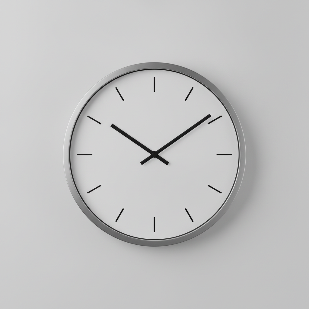
AI wall clock design generator result: a minimal round clock on a pale grey wall, brushed steel bezel, flat white dial, twelve slim black batons and no numerals at all. This is the cleanest frame on the page and the marker count is genuinely right: twelve batons, evenly spaced, with the four at the quarters drawn longer than the other eight. Nothing in the prompt asked for that longer quarter marker, and it is exactly the convention real dials use, because the quarters are what your eye lands on first. The time reads as ten past ten. Worth studying for the one thing it very nearly gets wrong: the hour hand is only slightly shorter than the minute hand and barely thicker, so at a glance across a room the two are close to interchangeable, which is the single most common failure in modern clock design
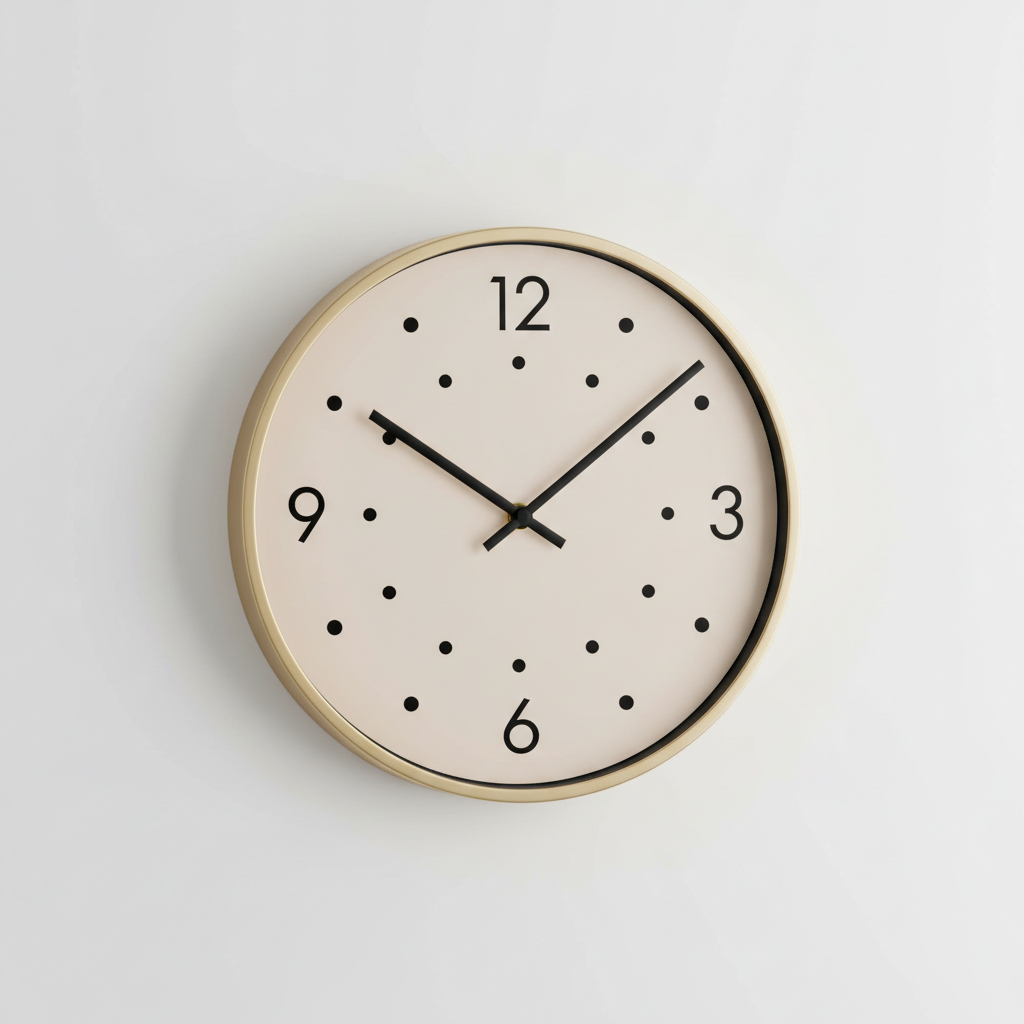
A cream dial in a brass bezel carrying only four numerals — 12, 3, 6 and 9 — with dots standing in for the other eight hours. The type is the success here: four common numerals at the four cardinal points, spelled and placed correctly on the first attempt, which is the safe end of what this model does with characters. The dots are the failure, and they are worth looking at closely, because they are not on one circle and they are not eight. They wander in and out at different radii and there are far more than eight of them, so the ring reads as scattered confetti rather than as an hour track. That is the counting limit in a single frame: it will letter a dial for you and it will not count one
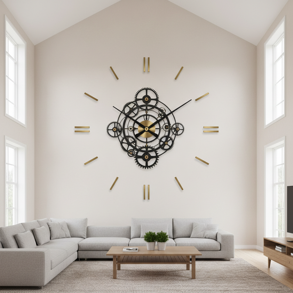
An oversized skeleton clock filling a double-height living room wall, its brass hour markers fixed directly to the plaster with no backing dial behind them, hands rising from a black openwork gear disc at the centre. Two lessons sit in one picture. First, scale: this is the frame that shows why a 25 centimetre clock disappears on a wall like this and why statement clocks are sold at 60 to 90 centimetres across. Second, and more useful, the centre is a dense black tangle of gears and the hands are also black, so they sink into it and vanish exactly where they need to be read from. The minute hand also stops well short of the marker ring, so it never actually points at an hour position — a clock you can read to the hour and not to the minute
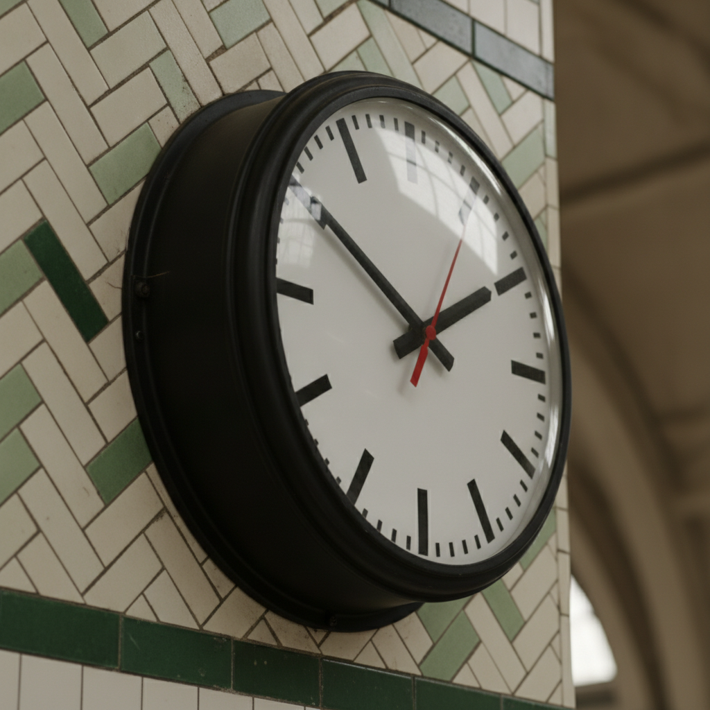
A vintage railway station clock in a deep black cast case with domed glass, mounted on a green and cream tiled pier and shot from a steep three-quarter angle. The dial is completely blank of lettering, which matters because station dials traditionally carry a maker name and this is the surface where the model most wants to invent one. The construction is convincing: bold black batons, a fine minute track of small ticks between them, a slim red second hand, and enough case depth that you can see the hands standing proud of the dial. The accident is the best part. The domed glass is throwing a hard window reflection straight across the upper left of the dial, wiping out the markers behind it — an unasked-for demonstration of why glazed and glossy dials lose their top corner to whatever window faces them
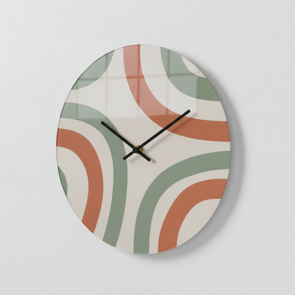
A frameless printed dial in terracotta and sage arcs, black hands set to ten past ten, hanging on a white wall. This is what happens when the artwork wins the argument: it is the most attractive object on the page and it has no hour markers whatsoever, so you can read roughly ten past ten from it and nothing more precise than that. It also demonstrates two other constraints without being asked to. A small brass hub sits dead centre, on top of the artwork, because that is where the movement shaft has to come through. And the glossy printed surface is mirroring a window grid across the whole upper half of the dial, the second frame on this page to do so unprompted
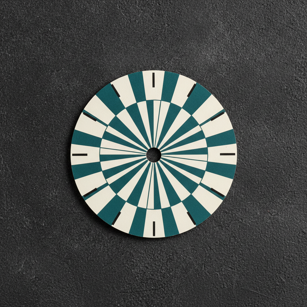
The flat face artwork, and the most practically useful frame here: one circular printed dial photographed straight down on charcoal, with no hands, no case and no glass, a punched hole at the exact centre and slim black batons around the rim. This is close to what a manufacturer actually receives — a flat circular file at a stated diameter with the shaft hole marked — rather than a photograph of a finished clock. The batons count correctly at twelve. The teal and cream radial wedges are also a quiet warning: they converge on the centre in a dense starburst precisely where the hub sits and where two black hands will sweep, so the busiest part of this design is the part that will be covered and crossed for the rest of its life
How the AI Wall Clock Design Generator Works
Pick the kind of clock
Minimal marker dial, four-numeral dial, oversized skeleton, station clock, printed art dial, or the flat dial artwork itself. That choice decides whether there is a dial at all, whether the markers sit on a face or on the wall, and how much of your design the hands are going to cross.
Name the dial, the finish and the hands
Say the material and the surface — matte board, brushed metal, oak veneer, glazed or open — then the palette, then the hand style and colour. Hands are the part everyone forgets to specify and the part that decides whether the clock can actually be read.
Hand it over with the numbers attached
Concepts arrive in about twenty seconds at up to 4K. The render settles what the clock looks like; you write down the four things it cannot hold — dial diameter, shaft hole size, movement type and hand length — and a maker turns the pair into an object that keeps time.
What a Wall Clock Render Settles, and What It Hides
Six things decide whether a dial design becomes a clock somebody can actually read, and an image carries about two of them. Knowing which two is the difference between a concept a maker can quote from and a beautiful picture of a clock nobody can tell the time by.
Two opaque bars cross the design forever
No other product has moving parts permanently sweeping its own surface. Over twelve hours the hands take 43,200 distinct positions, so a dial has to work with them anywhere, not just in the arrangement your render happened to choose. Anything detailed or precious in the middle third gets crossed, covered and lost. Design the centre to be interrupted, because it will be.
Hand contrast is the product, not the trim
A wall clock is read in under a second from several metres, and that reading is entirely two angles. The hour hand must be clearly shorter and clearly thicker than the minute hand, or the two become interchangeable at a glance — the minimal dial in the gallery is only just on the right side of that line. Contrast in value, not hue: a mid grey hand on mid terracotta is invisible whatever the screen says.
A hole and a hub own the exact centre
A quartz movement pushes a shaft through a hole of roughly 8 to 11 millimetres dead centre, and the hand hub covers 15 to 25 millimetres around it. The strongest position in any circular composition is therefore hardware, not artwork. Same class of constraint as a phone case camera cutout, except here it lands in the middle rather than the corner.
Twelve of anything is the one thing it miscounts
A dial is twelve evenly spaced elements on one circle, which is exactly where this model fails. The four-numeral dial above spelled its numerals perfectly and then scattered its dots at random radii in the wrong quantity. Ask for markers without stating a number, count them in the render, and do the final rotate-and-duplicate in a vector tool where twelve is one operation.
Glass and gloss put the room on your dial
Two of these six renders mirrored a window across the dial without being asked. Clocks hang on the wall opposite the window, so a glazed or glossy face loses part of itself to reflection at exactly the hours you want to read it. Matte scatters that light and stays readable; gloss photographs richer for the listing. Choose which one you are optimising, or pay for anti-reflective glass.
The movement is a spec sheet, not a look
Nothing visible tells you whether a clock ticks. A standard quartz movement steps once a second and is audible at night; a sweep movement is silent and costs more. Shaft length must match dial thickness or the hands will not seat, and hands much over twenty centimetres need a high torque movement. Hands themselves are a catalogue part chosen by length and fitting, not something the render draws.
Numerals, Markers and What the Model Cannot Count
A dial is the only surface in this whole series where the design brief is literally a counted sequence, and counting is where this model is weakest. Here is the boundary, drawn from what actually rendered on this page.
Safe to render
Four separate numerals at the quarters. The 12, 3, 6 and 9 on the cream dial above came back correctly formed and correctly placed on the first attempt, because four common characters at four fixed points is not a sequence — it is four small independent jobs. Batons and dots are safer still, and a markerless dial is safest of all.
Keep out of the render
A full 1 to 12 dial, Roman numerals, a date window, a subsidiary seconds dial, a minute track numbered in fives, and any maker name. All of these are ordered numerals at rotating angles, which is the failure mode this model hits hardest — you get eleven numbers, or two sevens, or a thirteenth wedged in where it fits.
Do it the way the trade does it
Nobody draws twelve markers by hand. A dial is built from one marker rotated and duplicated at thirty degree intervals, which a vector tool does perfectly in seconds. Generate the dial artwork, palette and material here, then place the marker ring and any numerals in software where twelve means twelve and even spacing is arithmetic.
Clock trade dress finds its own way in
Ask for a clock and the model drifts toward the famous ones. A station dial in particular wants a maker name printed under the twelve, and several well-known dials are protected designs in their own right. Every preset here refuses clock and watch brand names, maker names and model names individually, which is why nothing on this page carries one.
Why Use This AI Wall Clock Design Generator
Six builds, not six colourways
A minimal marker dial, a four-numeral dial, a wall-mounted skeleton, a cased station clock, a printed art dial and a flat production disc differ in construction, cost and what you are even allowed to design on. Switching preset changes what the object is rather than what shade it happens to be.
The production artwork built into the presets
One preset renders the dial flat, alone, hands off, with the shaft hole punched — because that circular file at a stated diameter is what a maker actually receives, and it is the thing every finished-clock mockup hides. It is also a standing reminder to count the markers before you accept the design.
Presets written around the hands
Every preset states hand length, hand width and hand colour explicitly, and the printed art dial deliberately keeps its middle third pale so the hands read across it. Hands are what everyone forgets to specify and the only reason the object exists.
Dial lettering refused item by item
Maker names, model names, Roman numerals, date windows, subsidiary dials and known clock trade dress are banned individually rather than with one blanket instruction, which is the difference between a clean dial and a concept with invented words printed under the twelve.
Consistent across a whole range
Nano Banana Pro holds a described palette across separate generations, so keeping one colour story and one material while changing only the clock type gives you a décor collection that reads as a single line rather than six unrelated clocks.
Cheap enough to test the whole range
About twenty seconds per concept and plans from $2.99 means you can put six dials in front of an audience, or find which one reads at thumbnail size, before commissioning a sample with a minimum order attached to it.
AI Wall Clock Design Generator FAQ
Related Dial and Décor Design Tools
AI Watch Face Design Generator
The same circle, a completely different set of rules. A watch face is a screen that redraws itself — always-on dimming, live complications, burn-in — where a wall clock is a printed disc with two catalogue hands driven by a quartz movement.
AI Wall Art Generator
The other thing on the same wall, and the honest comparison. Wall art is a flat printed image behind glass that nothing ever crosses. A clock is the same wall, minus the middle third, plus a hole and two moving bars.
AI Pattern Generator
Where to go when the dial artwork needs to be a genuine repeat rather than a one-off placement, or when the same design has to run across a whole homeware range instead of a single printed disc.
Design Your Wall Clock Now
Six clock builds, dial materials that render with the right surface, a flat production disc that shows what a maker actually receives, and 4K product shots in about twenty seconds. Free to start, from $2.99 for more.
Start Designing FreeAbout This AI Wall Clock Design Generator
An AI wall clock design generator is genuinely useful on one part of the job and quietly misleading on the rest, so it is worth drawing the line before you start. A wall clock is four decisions stacked on each other, and only one of them is a picture. The first is what kind of object it is: a cased clock with a dial behind glass, a frameless printed disc, or an open skeleton whose markers are fixed to the wall itself with nothing behind them. The second is the movement, which is a spec sheet rather than a look — standard quartz that steps and ticks audibly, or a sweep movement that is silent and costs more, matched to a shaft length that suits your dial thickness and a torque rating that suits your hand length. The third is dimension: dial diameter, the size of the shaft hole through the middle, and the viewing distance that sets how large the markers have to be. Only the fourth, what the dial actually looks like, is something an image can settle, and it happens to be the part everybody argues about hardest and describes worst. That is what this tool does in about twenty seconds.
What makes a clock unlike every other product in this series is that two opaque bars sweep across the design permanently, and there are 43,200 positions they can occupy over twelve hours. Every instinct a designer brings from posters, prints and packaging says put the good thing in the middle; on a dial the middle is where a metal hub sits on top of your artwork and where two hands cross it for the rest of its life. The printed art dial in the gallery above shows the pleasant version of that problem — a genuinely beautiful object with no hour markers at all, which you can read to roughly ten past ten and no further. The skeleton clock shows the unpleasant version: a dense black gear cluster at the centre with black hands that sink into it and disappear. Both are fixable in the same way, by designing the centre third to be interrupted and by giving the hands a value contrast rather than just a colour difference. The trade fix worth stealing is a thin light outline on the hands, which lets one hand set stay visible over both the light and dark regions of a busy dial.
The most useful thing to know about this AI wall clock design generator is where its counting stops, because a dial is the one design brief in this whole series that is literally a counted sequence. The four-numeral dial above makes the point in a single frame: the numerals 12, 3, 6 and 9 came back correctly formed, correctly rotated and correctly placed on the first attempt, and the eight dots that were meant to fill the remaining hours came back at wandering radii and in the wrong quantity. Characters it can draw; twelve evenly spaced anything it cannot. So prefer markerless and minimal dials, which are the dominant contemporary style in any case, use four cardinal numerals if you want anchors, avoid full 1 to 12 dials and Roman numerals entirely, and always count the markers in a render before you accept it. Then do what the trade does and finish the dial in a vector tool, where twelve markers is one marker rotated at thirty degree intervals and even spacing is arithmetic rather than luck.
The last thing worth carrying away is what the images did without being asked, because it is more honest than anything the copy could claim. Two of the six renders put a window reflection across the dial on their own — the station clock loses its whole upper left corner to one, and the glossy printed dial mirrors a window grid across half its face. That is not a rendering error, it is the real behaviour of glazed and glossy dials, and it matters because a clock is almost always hung on the wall opposite the window. Matte scatters that light and stays readable from any angle; gloss photographs richer and loses part of itself in daylight; anti-reflective glass buys both and costs more. Everything numerical stays outside the picture in the same way: diameter, shaft hole size, dial thickness, movement type, torque and hand length are a written specification that travels beside the image rather than inside it. Do that and the tool earns its keep. It runs on Nano Banana Pro, which holds a described palette across separate generations, so one colour story can carry a whole homeware line; it is free to start and paid plans begin at $2.99; and it turns the slow, expensive, argumentative stage of a physical product — deciding what the thing will actually look like — into six pictures you can put in front of a customer long before a single sample is made.