AI Monogram Generator
Type two or three initials, get a composed monogram about thirty seconds later. This AI monogram generator does the part that used to mean an hour of tracing in Illustrator — weaving the letters, balancing their heights, wrapping a vine or a wreath around them — and it gets your initials right every time. Six monograms are below exactly as they came back, including the two where a letter broke out through its own frame.
Make a Monogram FreeTry the AI Monogram Generator — Free
Pick a style, then put your initials in the box in quotation marks, in the order you want them, and say which one should be largest. Each preset already carries the construction rules — how the letters interlock, how the frame sits, what surface it is printed on — so you only have to supply the letters.
AI Monogram Generator
Choose a monogram style, type your initials, and get a finished mark. Up to 4K.
Six Marks From This AI Monogram Generator, Shown Exactly As They Came Back
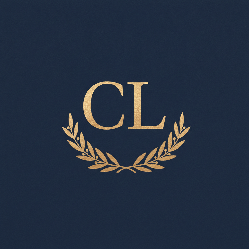
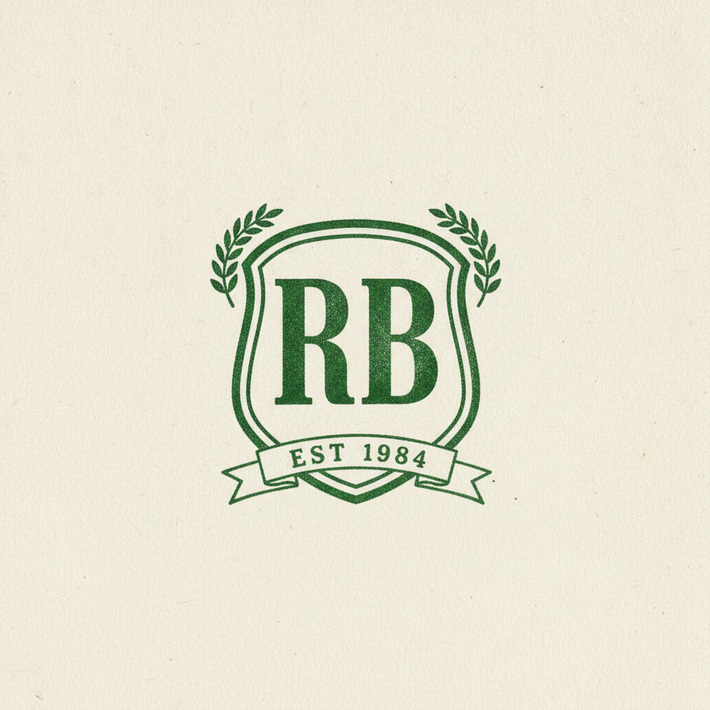
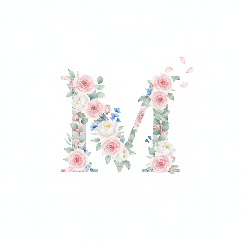
Nothing here has been retouched, recentred or regenerated to flatter the tool. Every initial dictated in the prompt came back correct on all six. Every mistake below is compositional — a letter through a frame, a wreath over a foot, a mark floating in a third of the image. Read the note under each one.
How It Works
Pick the monogram style
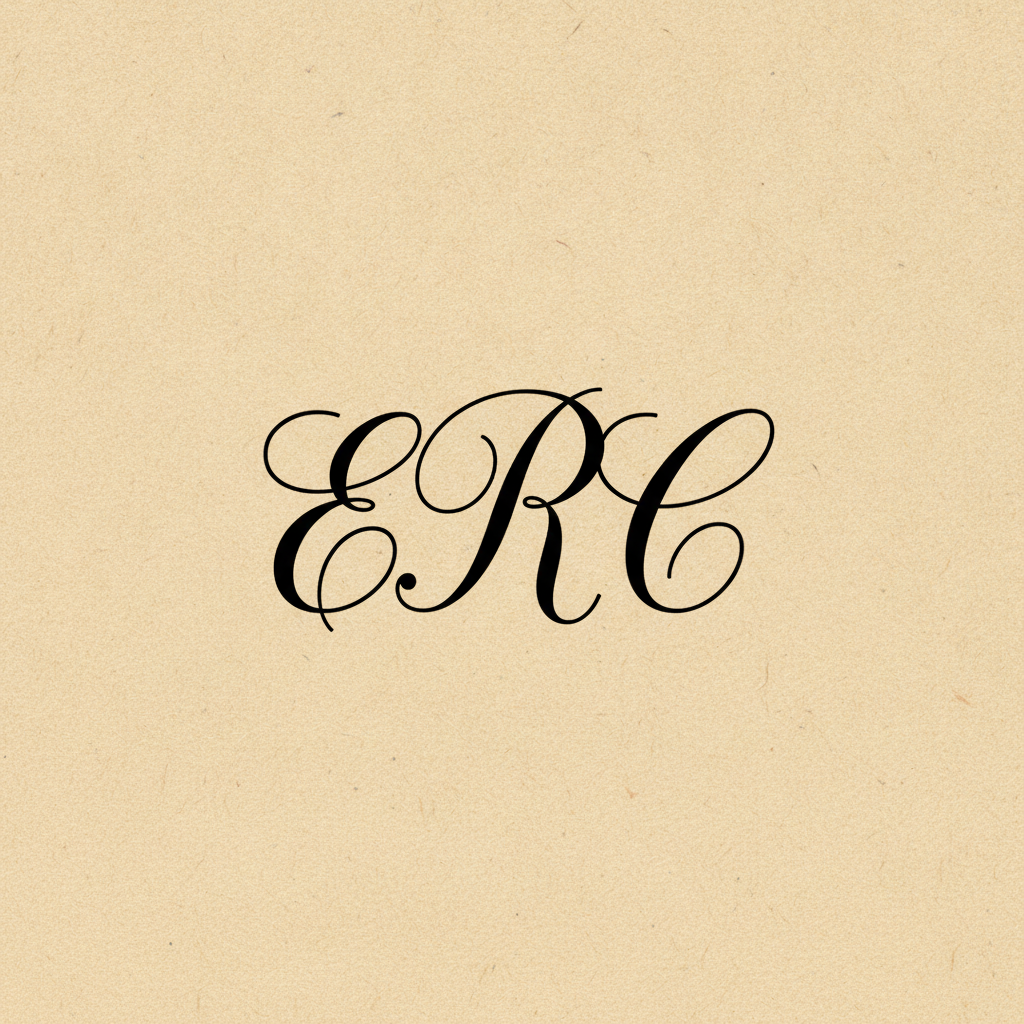
Six presets: interlocking copperplate script, a vine circle in flat line art, a modern geometric mark in a hexagon, a gold wedding duogram on navy, a letterpress crest with a ribbon banner, and a single letter filled with watercolour florals. Each one already carries the construction rules — how the letters weave, which one is tallest, what the frame is made of, what surface it prints on — plus the clauses this page learned to add about letters clearing their frames.
Quote your initials and say which is largest
Put the letters in quotation marks in the order you want them: the letters "E", "R" and "C", with R largest in the centre. Traditional three-letter monograms put the surname initial in the middle at a larger size, flanked by first and middle names. Thirteen out of thirteen dictated characters came back correct across the gallery above — including EST 1984 on the crest — so the letters are the part you can trust.
Check the edges, then crop
Thirty seconds later you have a monogram. Look at the edges first: is any letter touching or crossing its frame, and is anything sitting in front of a letterform that should be behind it. That is where five of the six results above went wrong. Then download at full size, up to 4K, and crop in — every mark here sat in roughly a third of the frame, which is generous margin if you want it and wasted pixels if you do not.
What This AI Monogram Generator Gets Right, and What It Gets Wrong
A monogram is a two-part problem: the letters, and everything around the letters. One of those halves is solved and the other is not. Here is exactly where the line falls, based on the six marks above rather than on a claim.
The initials are correct, every time
Thirteen dictated characters across six styles — copperplate script, high-contrast serif, geometric sans, heavy slab, watercolour letterform — and not one reversed, doubled, misshapen or invented. No extra initial appeared in a corner. If you have used image models for text before and expect a coin flip, this is the case where the strings are short enough that it simply works.
Letters break out of their frames
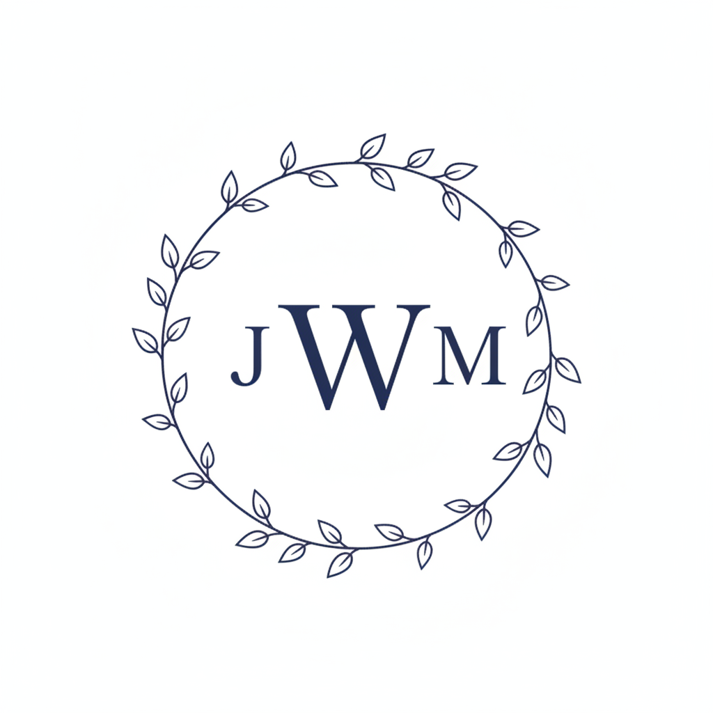
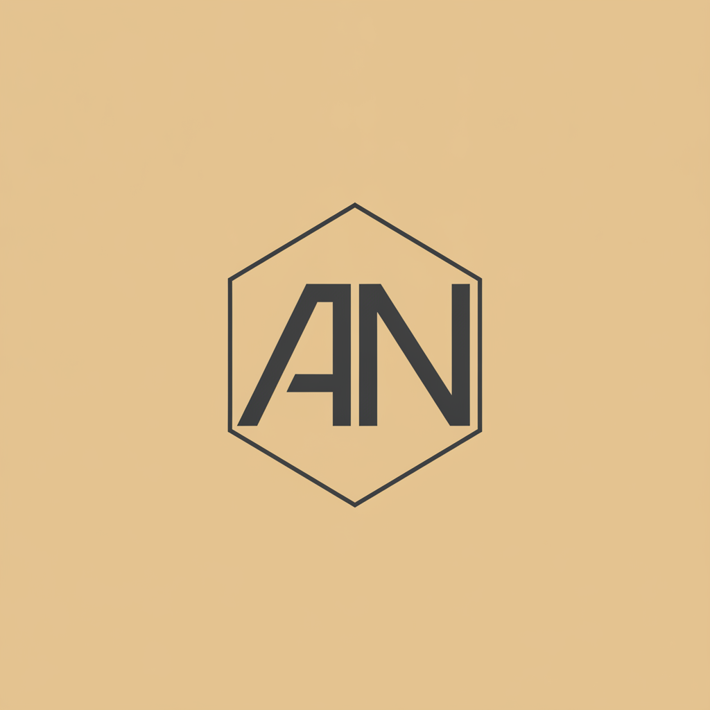
The M pushed through the vine circle. The N broke out of the right side of the hexagon and both feet crossed the bottom edge. Two of three framed styles failed the same way, in an instruction that explicitly asked for clear space. Say it twice, say it concretely, and inspect the edges of the result before anything else.
Decoration sits in front of letterforms
The laurel wreath on the gold duogram was asked to curve up beneath the letters and instead crossed in front of them, burying the foot of the L and part of the C. Stating that the ornament sits entirely behind the letters and never over them is worth a clause of its own, because the model treats the two elements as a single composition.
Style range is genuinely wide
Six clearly distinct registers came back: engraved calligraphy, flat vinyl-ready line art, contemporary flat vector branding, foiled wedding stationery, worn letterpress, and soft botanical watercolour. Nothing here reads as the same mark in a different colour, which is the usual failure of template-based monogram makers.
Size and overlap instructions get softened
A central letter asked to be twice the height of its neighbours came back about half again as tall. Two initials asked to interlock at their stems on the crest stood side by side with a gap. The model treats relative sizing and overlap as suggestions, so check them and restate them rather than assuming the second pass will differ.
The mark floats in a third of the frame
All six. Every prompt asked for a monogram filling most of the image and every result centred a small mark in a large field of paper or flat colour. That is a gift for stationery and a waste of resolution otherwise. Download at 4K and crop, or push far harder on tight cropping in the prompt.
Writing a Prompt That Produces a Usable Monogram
Four habits that separate a mark you can put on an invitation from one you regenerate, learned from the six in the gallery.
Quote the letters, name the order
"A monogram for the Carters" gets you initials the model chose. The letters "E", "R" and "C" with R largest in the centre gets you yours. Thirteen for thirteen across these six marks — the quotation marks do more work here than any other instruction.
Defend the margin explicitly
Say that a clear even space separates every letter from the frame on all sides and that no stroke, stem or foot crosses it. The vine circle and the hexagon both broke without a clause that blunt, and both are far more likely to hold with one.
Put ornament behind, in words
Wreaths, laurels, vines and ribbons drift in front of letterforms. State that the ornament sits entirely behind the letters, never crosses in front of them, and that the full shape of each letter including its feet stays visible. Then check the feet, which is where it fails.
Match the style to the endpoint
Heading for vinyl, embroidery or a stamp? Ask for flat single-colour line art with no shading, fill or gradient, which traces cleanly. Heading for a print or an invitation? Watercolour, foil and letterpress textures all look better and none of them will ever cut.
Who Uses an AI Monogram Generator
Couples planning a wedding
A duogram for the save-the-date, the invitation suite, the welcome sign, the napkins and the dance floor decal — all from one mark, in one afternoon, before a stationer has quoted for it. The gold-on-navy and vine circle presets cover the two looks most suites are built on.
Etsy and print-on-demand sellers
Personalised initials are one of the most durable categories on any craft marketplace. Generating listing artwork per order, in a consistent house style, turns a custom request into a five-minute job instead of an hour in Illustrator for a fifteen-dollar item.
Small brands and freelancers
A two-letter geometric mark is often all a consultancy, studio or clothing label needs. Explore twenty directions in an hour, pick one, then have it redrawn properly in vector — this is a concepting tool that saves the expensive part for the design that survives.
Stationers and calligraphers
Client-facing mockups before a nib touches paper. Show three script arrangements of the same initials, let the client choose, and hand-letter only the one they picked rather than the two they did not.
Home and gift personalisation
Door hangers, cutting boards, towels, wall prints, a crest for a family binder. The letterpress crest with a founding year on the banner is the preset that surprises people most, because the banner text comes back spelled correctly.
Event and hospitality designers
A house monogram for a restaurant menu, a hotel key card, a members club, a private dinner. One set of initials, six visual registers, and a decision made by looking rather than by describing.
AI Monogram Generator FAQ
Related Lettering & Identity Tools
AI Logo Generator
When the mark needs a name beside it rather than initials alone. Wordmarks, symbols and full lockups, with the same rule about quoting every word you need spelled correctly.
AI Typography Generator
Letterforms as the subject themselves — type treatments, drop caps and lettering experiments. A good place to find the script you want before building a monogram around it.
AI Wedding Decoration Generator
Where a duogram usually ends up. Signage, table settings, backdrops and stationery styling for the day the monogram was made for.
Put Your Initials Together
Six monogram styles — interlocking script, vine circle, modern geometric, gold wedding duogram, vintage crest and floral letter — each a finished mark in about thirty seconds, with your initials in the order and the sizes you asked for. Up to 4K. Free to start, from $2.99.
Make a Monogram FreeAn AI Monogram Generator for Weddings, Gifts, Crafts and Small Brands
A monogram looks like the simplest thing a designer makes and is one of the fiddliest. Two or three letters have to be chosen from a font that suits the occasion, scaled against each other so the surname initial dominates without swamping its neighbours, positioned so their flourishes weave rather than collide, and then set inside a circle, a shield or a wreath with even space on every side. Done by hand that is an hour of nudging anchor points for something that will be printed at two centimetres across. An AI monogram generator collapses that hour into about thirty seconds — which makes it worth writing an honest page about rather than a marketing one, because the half of the job it does brilliantly and the half it fumbles are cleanly separable.
The six presets here cover the monograms people actually ask for: an interlocking copperplate script of the kind engraved on wedding plate, a vine circle in flat single-colour line art that traces cleanly for a vinyl cutter, a modern two-letter geometric mark in a hexagon for a brand identity sheet, a gold duogram on deep navy with a laurel half-wreath for stationery, a letterpress crest with a founding year on a ribbon banner, and a single ornate letter filled with botanical watercolour. Each preset carries the construction knowledge — which letter is tallest, how the letters interlock, what the frame is made of, what surface it prints on — plus the clauses this page learned to include after looking at the results: that no letter crosses its frame, that ornament sits behind the letterforms rather than over them, and that the full shape of every letter including its feet stays visible.
The six marks above are shown exactly as they were generated, mistakes included, because the pattern in them is more useful than any feature list. The letters are the solved half: thirteen dictated characters across six wildly different type styles — E R C in copperplate, J W M in a high-contrast serif, A N in a geometric sans, C L in gold, R B in a heavy slab with EST 1984 on a banner beneath, and a watercolour M — and every one came back correctly formed, correctly ordered and free of invented extras. Composition is the unsolved half, and it fails in three consistent ways. Letters break out through their frames, as the M did through the vine circle and the N did through the hexagon. Ornament drifts in front of letterforms, as the laurel wreath did over the foot of the L. And relative instructions get softened: a centre letter asked to stand twice as tall came back half again as tall, and two initials asked to interlock stood side by side with a gap between them. All six marks also arrived floating in roughly a third of the frame.
The working rule follows directly. Quote your initials and name their order and their relative sizes. Defend the margin in plain words, because the frame collision is the failure that ruins a monogram rather than merely dating it. Say that wreaths and vines sit behind the letters. Match the style to where the file is going — flat line art if it will be cut, embroidered or stamped, watercolour and foil if it will be printed. Then check the edges of the result before you look at anything else, download at 4K, and crop in to the mark. Inside those limits this is an unusually good trade: the part that used to cost an hour of tracing now costs half a minute, and you get to see your initials properly set before you have finished deciding whose they are.