
AI Candle Label Generator
A candle label is two things printed on one small band of paper: the design that sells the jar, and a block of weights, business details and fire-safety wording that exists because the product is an open flame. This AI candle label generator settles the first half in about twenty seconds, and is straight with you about the second half — which it deliberately refuses to invent.
Start Designing FreeTry the AI Candle Label Generator — Free
Pick the build first, then name the vessel, the stock and the brand name you want on it — one or two short words, because that is where this model’s lettering is reliable, and because it will invent a name of its own if you leave it out. Every preset refuses net weights, burn times, allergen lists, addresses, barcodes and the fire-safety block by name, and leaves clear space for them instead, because those belong in set type that a person has checked.
AI Candle Label Generator
Pick a label build, name your brand and vessel, and get candle label concepts and jar shots at up to 4K
Labels Designed With This AI Candle Label Generator
These came from the presets above, flaws included, and the captions say what each one gets right and what it quietly invents. The fourth is not a jar at all but the label laid out flat, because a flat die-cut shape with bleed around it is what a label printer actually receives — and it is also the frame that failed most usefully. Read the set for artwork, palette and material. Treat every dimension, every die line, every stock and every word of the compliance block as a specification for whoever prints it.
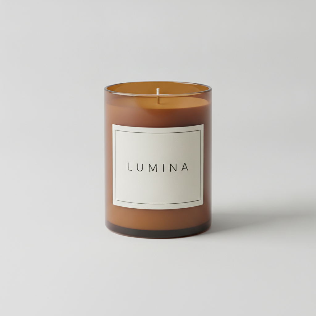
AI candle label generator result: an amber glass jar on a pale grey studio backdrop wearing a cream label with a thin hairline frame and LUMINA in widely spaced sans-serif capitals. The spelling is clean, the label sits exactly where it should — centred on the straight body, below the wax fill line, well clear of the rim and the base — and that placement is not a detail, because the jar wall above the wax runs much hotter during a burn and is where labels scorch and lift. Two things are not what was asked. The prompt specified a wrap-around landscape label and what arrived is a near-square front panel whose left and right edges are dead straight parallel lines with no foreshortening, so it reads as a flat sticker composited onto a cylinder rather than paper wrapped round one. The cream wax also came back the same caramel tone as the amber glass, which is what happens when you ask a model for a colour that has to be read through a tinted vessel. And note what a finished-looking retail candle is missing here: no net weight, no fire-safety warning, no manufacturer line
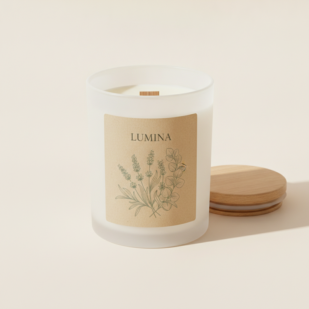
A frosted white glass jar with a wooden lid resting beside it, carrying a kraft-toned portrait label: a fine hand-drawn botanical of lavender stems, eucalyptus and seed heads in sage-green ink, with LUMINA above it in a serif. The illustration is the strongest artwork on this page and genuinely reads as line work rather than a filter, the flat wooden wick is correct for the style, and the label again sits below the fill line. Three problems. The label is once more a flat panel, its side edges running straight off the curve of the jar with no shading. The lid has a phantom second white disc underneath it that no real lid has, which is the sort of construction error this model makes constantly. And there is a small unexplained gold speck on the eucalyptus stem at the right edge — trivial on screen, a visible defect at print size. The kraft stock is a real decision rather than a look: uncoated paper drinks fragrance oil and discolours in weeks
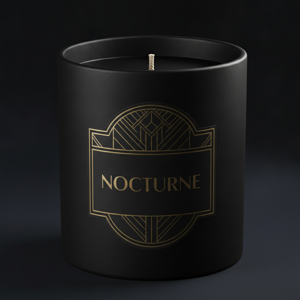
A matte black ceramic vessel shot close on a dark background with an art deco gold crest and NOCTURNE in fine gold capitals, correctly spelled. As luxury home-fragrance packaging it is the most convincing frame here, and the crest bends slightly with the curve of the vessel instead of sitting flat on it. The interesting failure is that it is ambiguous about what it even is: a faint glossy rectangle is visible around the top of the crest, so the artwork is part clear-film label and part direct print onto the ceramic, and those are two different production routes with different tooling and very different unit costs. The shaped die that was asked for is drawn rather than cut — the outline is artwork on a rectangular substrate. The gold holds one flat tone across the whole curve, where real hot foil flares as the vessel turns. The cotton wick is also long and untrimmed with no visible sustainer tab
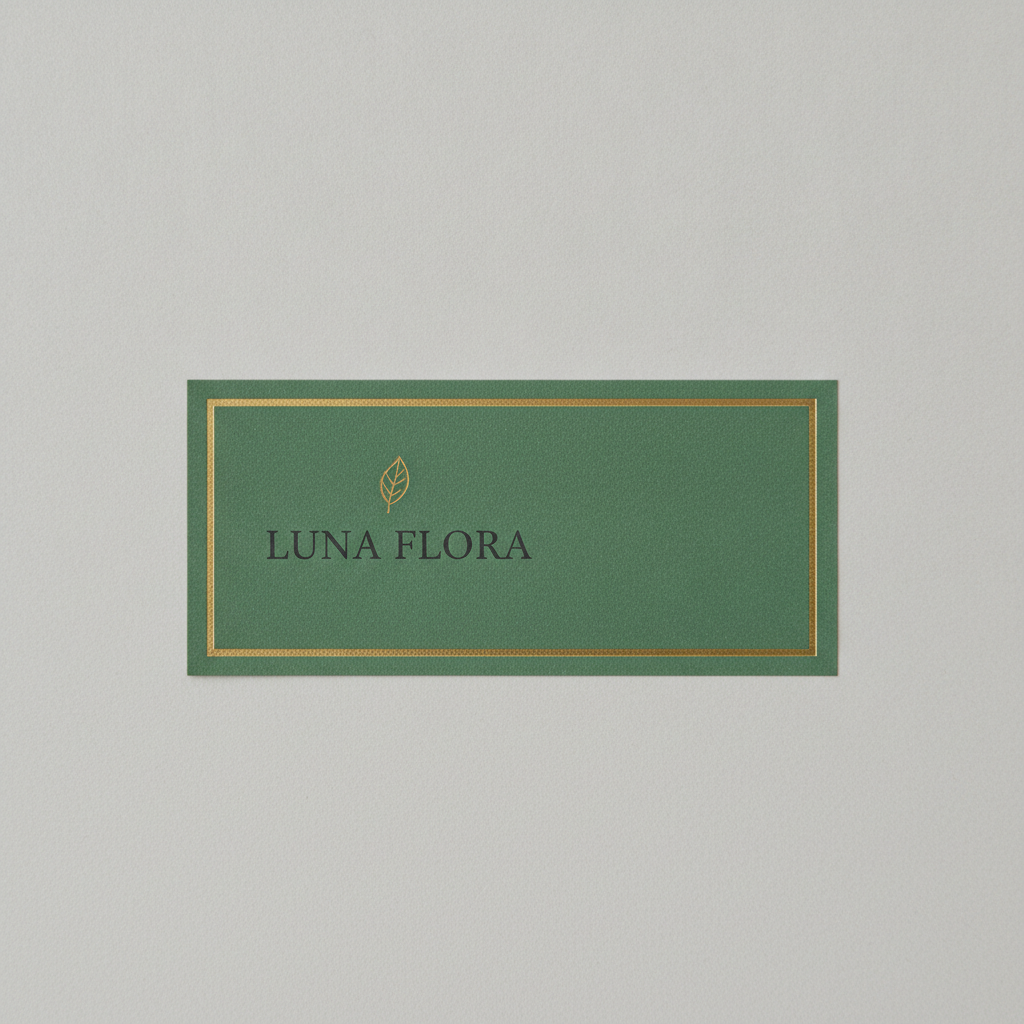
The flat label layout, and the most instructive frame on the page. A green field with a gold rule frame, a small gold leaf emblem and LUNA FLORA in dark serif capitals, shot flat with no jar. It looks like a print file and it is not one. There is no bleed — the artwork stops dead on the cut line, so a die cutting there with its normal drift would shave green off one edge and leave a pale sliver on the other. There is no die line drawn as a separate layer and no crop or registration marks. The corners came back square rather than the rounded radius that was specified. The model did honour one instruction well: the lockup sits left and the right third is left as clear unprinted space. The gold rule is a stippled printed gradient rather than foil. Its proportions, about two and a half to one, are only a guess at your jar — a full wrap is the circumference of the glass, so measure the vessel you have actually sourced
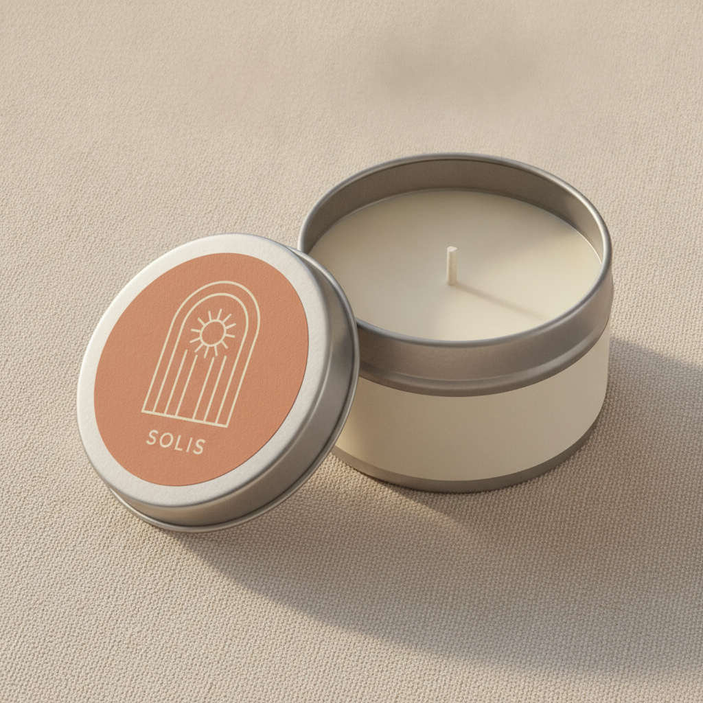
A silver travel tin sitting open on oat linen, its lid face up beside it carrying a circular terracotta label with an arch and sun motif in cream and SOLIS in small spaced capitals. The circle is a real die shape a converter can cut, the artwork is genuinely printable, and the tin deliberately wears a blank cream band around its side — which is exactly the panel the net weight and the fire-safety block would occupy, left empty on purpose. What the render cannot tell you is that a metal tin is the hardest surface in this set to label: the lid and the walls get hot enough during a burn to soften ordinary adhesives, so a paper label on a tin lifts at the edges unless the stock and glue are specified for it. The wick is wrong too — a blunt pale peg with no braid and no sustainer tab — and the tin throws a hard-edged shadow that does not match the soft daylight elsewhere in the frame
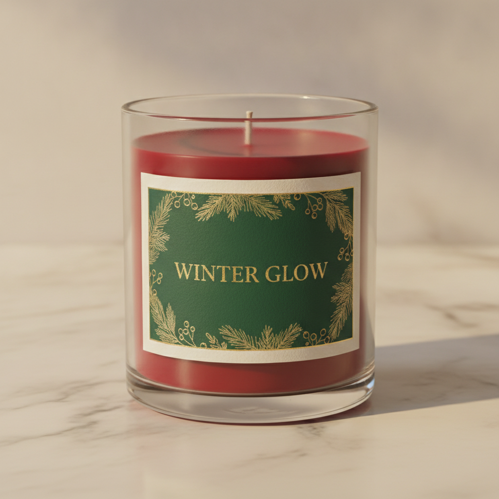
A clear glass jar of deep red wax on marble in warm low light, wearing a landscape wrap label: a forest green field inside a cream margin, a fine gold border of pine sprigs and berries, and WINTER GLOW in gold serif capitals across the centre, correctly spelled. The seasonal artwork is good and the label sits properly below the fill line. It still does not wrap — the side edges are straight verticals and the gold border shows almost no compression toward them, where paper on a real cylinder foreshortens sharply at the sides. The wax carries a phantom circular seam near the surface, the wick is another blunt tab-less stub, and the shadow is harder than the light behind it justifies. Clear glass is the real specification hiding here: it makes the dyed wax part of the design, and dye is the component that fades in daylight and can stain the glass
How the AI Candle Label Generator Works
Pick the build and the vessel
Modern minimal, botanical apothecary, black and gold, a flat wrap layout, a travel tin lid or a seasonal gift jar. Name the vessel with it, because an amber jar, a frosted jar, a matte ceramic, a metal tin and clear glass each take a different label size, a different stock and a different adhesive — and if you leave it out, the model will pick one for you.
Give it a short brand name and a stock
One or two short common words in capitals is where this model’s lettering is reliable, and all six labels above proved it. Always supply the name yourself: leave it blank and you get an invented one, and a different invented one on the next render. Then say the stock and the finish — uncoated kraft, coated white, clear film — and the palette. Leave weights, burn times and addresses out entirely; the presets refuse them on purpose.
Hand it over with the compliance block attached
Concepts arrive in about twenty seconds at up to 4K. The render settles what the label looks like; you write down what it cannot hold — wrap length, height, corner radius, bleed, face stock, adhesive temperature rating, laminate, foil — plus the net weight, your business details and the fire-safety wording, and a designer or your label printer turns the pair into a file that can be pressed.
What a Candle Label Render Settles, and What It Hides
Six things decide whether a candle label can actually be printed, applied and sold, and an image carries about two of them. Knowing which two is the difference between a concept your printer can quote from and a beautiful picture of a jar that would not be legal on a shelf.
Part of the label is text you must never generate
Net weight in ounces and grams, the name and place of business of the maker or distributor, and a fire-safety block built to ASTM F2058 with a signal word, a fire pictogram and the cautionary statements. In the EU and the UK a scented candle can also need CLP hazard labelling and an allergen declaration. None of that is design, all of it is specified elsewhere, and a model that invents a weight or an address has not made a typo. Every preset here refuses it by name and leaves clear space instead.
The wrap length is the circumference, not the width
A full wrap on a straight-sided 8 to 9 ounce jar is roughly 8.6 to 9.4 inches long for a 2.75 to 3 inch diameter, minus about an eighth of an inch so the ends do not overlap. A render cannot know your jar: the flat layout above came back at about two and a half to one, which is a guess. Measure the vessel you have sourced, and remember a tapered vessel needs an arc-shaped die or a shrink sleeve, not a rectangle.
Bleed and safe margin never survive the render
Bleed is artwork pushed about 3 mm or 0.125 inches past the cut line so the die always cuts through ink, and the safe margin is the matching distance inward that type must stay inside. The flat layout above has neither: the artwork stops dead on the cut line, so normal die drift would shave colour off one edge and leave a pale sliver on the other. Its corners also came back square where a radius was specified.
Heat decides where the label goes
The jar wall above the wax line runs hotter than the part with wax behind it, so a label that creeps above the fill line will scorch, yellow or lift. Every jar in the gallery happens to be labelled correctly below that line, which is worth copying rather than assuming. Metal tins are hardest of all: lid and walls get hot enough to soften an ordinary adhesive, so the glue needs a temperature rating as well as the stock.
Fragrance oil is a material problem, not a smell
Fragrance oil dissolves and wicks into uncoated paper, so the kraft stock that looks so good in the second image will stain and darken from residue on the outside of the jar. Most makers end up on a white or clear polypropylene film with a laminate over the print, which survives oil, water and being handled warm — and looks nothing like uncoated paper, so choose the material before you fall in love with the render.
Foil and emboss are tooled processes, not colours
Hot foil stamping, embossing, debossing, screen printing and spot varnish are each quoted, tooled and minimum-ordered separately, and each needs its own spot layer in the artwork. A render shows the impression and none of the substance: the gold on three labels here holds one flat tone across the whole curve, where real foil flares as the jar turns. Name each finish as a spec and sign off from a physical proof.
Brand Names, Small Print and What to Keep Off the Render
Some of a candle label is design and some of it is compliance, and the two need treating completely differently. Here is the boundary, drawn from what actually rendered on this page.
Safe to render
One or two short common words in capitals, set large, with room around them. Every name above came back correctly spelled — LUMINA, NOCTURNE, LUNA FLORA, SOLIS and WINTER GLOW. If the words are everyday English and they fit on one line, the model will spell them.
Keep out of the render
Net weights, burn times, fragrance and allergen lists, business addresses, barcodes, recycling marks and the fire-safety block. Digit strings and long lines of small type are this model’s weakest case, and they are also the parts that a standard specifies — the worst possible overlap.
It will name your brand for you
Leave the name blank and one arrives anyway, and it changes between generations — this page produced LUMINA twice, then NOCTURNE, LUNA FLORA and SOLIS. Convenient for a moodboard, useless for a range, and no kind of clearance: check anything you intend to keep against the trademark register before it goes on a jar.
Do it the way candle makers do it
Almost nobody puts the compliance text on the front label. The design is agreed, then the net weight, the business details and the fire-safety block go on a second label on the base or the back, printed on a durable film so they stay legible for the life of the candle. Design the front here, and set the rest where you control every character.
Why Use This AI Candle Label Generator
Six builds, not six colourways
A minimal wrap, a botanical apothecary panel, a shaped black-and-gold die, a flat print layout, a circular tin lid and a seasonal gift jar are six different jobs with different die shapes, different placements and different costs behind them. Switching preset changes what the label is rather than what shade it happens to be.
The flat layout built into the presets
One preset renders the label flat with no jar, because a die-cut shape with bleed around it is what a label printer actually receives and it is the thing every jar mockup hides. It is also a standing reminder to check that the wrap proportions match your vessel and that the artwork runs past the cut line.
The compliance block refused item by item
Net weights, ounces and grams, burn times, allergen lists, manufacturer addresses, barcodes, recycling marks and the fire-safety warning are banned individually rather than with one blanket instruction, which is the difference between a clean concept and a jar with invented safety text printed across it.
Written as jar photography
Every preset names a vessel, a placement on the glass relative to the wax line, a camera angle and a described light, so concepts arrive looking like the Etsy or shelf photograph a candle eventually needs rather than flat artwork floating on a gradient.
Consistent across a whole range
Nano Banana Pro holds a described palette and illustration style across separate generations, so keeping one colour story while changing only the fragrance name gives you a collection that reads as a single maker rather than six unrelated jars — as long as you supply the brand name every time.
Cheap enough to test the whole shelf
About twenty seconds per concept and plans from $2.99 means you can put six labels in front of a market stall, a stockist or a customer and find out which one gets picked up, long before a print run with a minimum order attached to it.
AI Candle Label Generator FAQ
Related Label and Packaging Tools
AI Label Generator
The general-purpose version, for jam, skincare, spice sets and soap wraps. Use it when the product does not burn and the compliance block is a net weight and an ingredients list rather than a fire-safety warning.
AI Wine Label Generator
The strictest label in this series. Same split between design and mandated text, but with a statutory Government Warning and a federal approval process behind it — worth reading if you are labelling anything regulated.
AI Packaging Design Generator
One step out from the label: gift boxes, sleeves, mailers and the carton a candle ships in. Useful once the jar is settled and the package around it needs to match.
Design Your Candle Label Now
Six label builds, stocks and inks that render with the right texture, a flat layout that shows what a label printer actually receives, and 4K jar shots in about twenty seconds. Free to start, from $2.99 for more.
Start Designing FreeAbout This AI Candle Label Generator
An AI candle label generator is genuinely useful on one part of the job and quietly misleading on the rest, and a candle draws that line in an unusual place. A label here is two documents printed on the same band of paper. One is the design — the stock, the palette, the illustration, the typographic feel, the shape of the die and the finish on top of it — and that is a matter of taste, argued about for weeks, described badly by everyone involved, and settled beautifully by a picture. The other is a short block of information that exists because the product is an open flame in a glass container: the net quantity of wax in both US customary and metric units, the name and place of business of the maker, packer or distributor, and a fire-safety warning built to ASTM F2058 with a signal word, a fire pictogram and the cautionary statements about burning within sight, keeping the candle clear of anything that catches fire, and keeping it away from children and pets. Sell into the EU or the UK and a scented candle can also need CLP hazard labelling and an allergen declaration naming components such as linalool or citral. This tool does the first document in about twenty seconds and deliberately refuses the second.
That refusal matters more here than it looks, because unlike wine there is no approval process to catch the mistake. Nobody reviews a candle label before it goes on a shelf, which means a jar with a hallucinated net weight or a plausible-looking address printed on it simply ships, and the problem surfaces later as a returns issue, a stockist rejection or worse. The fire-safety block is the sharpest case: it is standardised wording with a defined pictogram, it has to stay legible and uncovered for the life of the candle, and a model that paraphrases it has produced something worse than nothing, because it looks finished. So every preset on this page names those items individually and refuses them, and leaves deliberate clear space where they belong. The travel tin in the gallery shows the idea working — the artwork sits on the lid and the side of the tin is left as a blank band, which in production is exactly where the weight and the warning go. That is also how candle makers actually work: the front label is the design, and a second label on the base or the back carries the compliance text, printed on a durable film that survives heat and handling.
The six presets are builds rather than colourways, because a minimal wrap, a botanical apothecary panel, a shaped black-and-gold die, a flat print layout, a circular tin lid and a seasonal gift jar are six different production problems. The flat layout is the one worth studying, because it renders the thing every jar mockup hides — a label file is a flat die-cut shape with artwork pushed past the cut line on every edge, a separate die line, and any foil or emboss supplied as its own spot layer. Read it sceptically as well as usefully: the version in the gallery has the look of a print file and none of the mechanics, with the artwork stopping dead on the cut line, no bleed at all, no die line and square corners where a radius was specified. Its proportions are only a guess at your jar, too, and this is the measurement people get wrong most often — a wrap label is as long as the circumference of the glass, not as wide as the jar looks in a photograph, which on a common 8 or 9 ounce straight-sided jar means somewhere near nine inches rather than three. Layout renders are the most valuable thing you can ask this model for and the easiest to over-trust.
The second thing to carry away is a limit that turns up on every product page in this series and is unusually visible on a candle. The model renders what a surface looks like and invents how the object is assembled and how it behaves. Botanical line work, kraft paper fibre, art deco gold on matte ceramic and frosted glass all come back convincingly. The construction does not: the wooden lid in the second image has a phantom second disc underneath it, three of the wicks are blunt pegs with no braid and no sustainer tab, one label is ambiguous between a clear film and a direct print onto the vessel, and two labels that were asked to wrap the glass came back as flat rectangles with no foreshortening at the sides. Nor does anything numerical or physical: wrap length, height, corner radius, bleed, face stock, the temperature rating of the adhesive, whether the laminate survives fragrance oil, and whether the label sits below the wax line where the glass stays cool. Rendered foil is yellow pixels that will not flare when the jar turns, and hot foil, emboss, screen print and spot varnish are separately tooled and minimum-ordered processes rather than colours you can request. Treat all of it as a written specification travelling beside the image. Do that and this AI candle label generator earns its keep: it runs on Nano Banana Pro, which holds a described palette across separate generations so one colour story can carry a whole collection, it is free to start with paid plans from $2.99, and it turns the slow, expensive, argumentative stage of launching a candle line — deciding what the jar will actually look like — into six pictures you can put in front of a customer long before a print run. Nothing here is legal advice; verify the current requirements with the relevant standard and authority for your market, and let your label printer check the file before it goes on press.