AI Wine Label Generator
A wine label is two things stacked on one small rectangle: the design that sells the bottle, and a block of regulated text that decides whether the bottle can be sold at all. This AI wine label generator settles the first half in about twenty seconds, and is straight with you about the second half — which it deliberately refuses to invent.
Start Designing FreeTry the AI Wine Label Generator — Free
Pick the style of label first, then name the bottle shape, the paper and the brand name you want on it — one or two short words, because that is where this model’s lettering is reliable. Every preset refuses alcohol figures, volumes, bottler lines, appellations, barcodes and the Government Warning by name, and leaves the space for them instead, because those belong in set type that a person has checked.
AI Wine Label Generator
Pick a label style, name your brand and bottle, and get wine label concepts and bottle shots at up to 4K
Labels Designed With This AI Wine Label Generator
These came from the presets above, flaws included, and the captions say what each one gets right and what it quietly invents. The fourth is not a bottle at all but the label laid out flat, because a flat die-cut shape with bleed around it is what a label printer actually receives — and it is also the frame that failed most usefully. Read the set for artwork, palette and material. Treat every dimension, every die line and every word of the regulated block as a specification for whoever prints it.
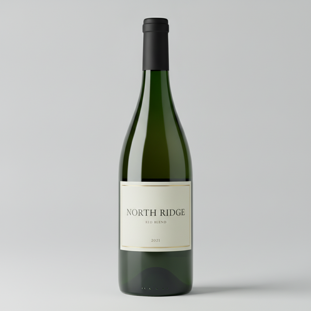
AI wine label generator result: a dark green bottle on a pale grey studio backdrop carrying a minimal cream label — a thin gold hairline frame, NORTH RIDGE in widely spaced serif capitals, RED BLEND beneath it and the year 2021 at the foot. Every character is spelled correctly, which is the safe end of what this model does with type: short common words, all capitals, one four-digit year, nothing crowded. Two things are not what was asked for. The prompt specified a Bordeaux bottle — high square shoulders, straight sides — and what arrived is a Burgundy, with the shoulder sloping away from the neck, and that matters more than it sounds because the two shapes take different label widths and a Bordeaux front label will crease if you wrap it onto a Burgundy curve. The label also sits too low, down where the body starts turning into the base, rather than centred on the straight cylindrical section where a real front label is applied. And note what is absent from a bottle that looks finished: no alcohol content, no net contents, no bottler line and no Government Warning
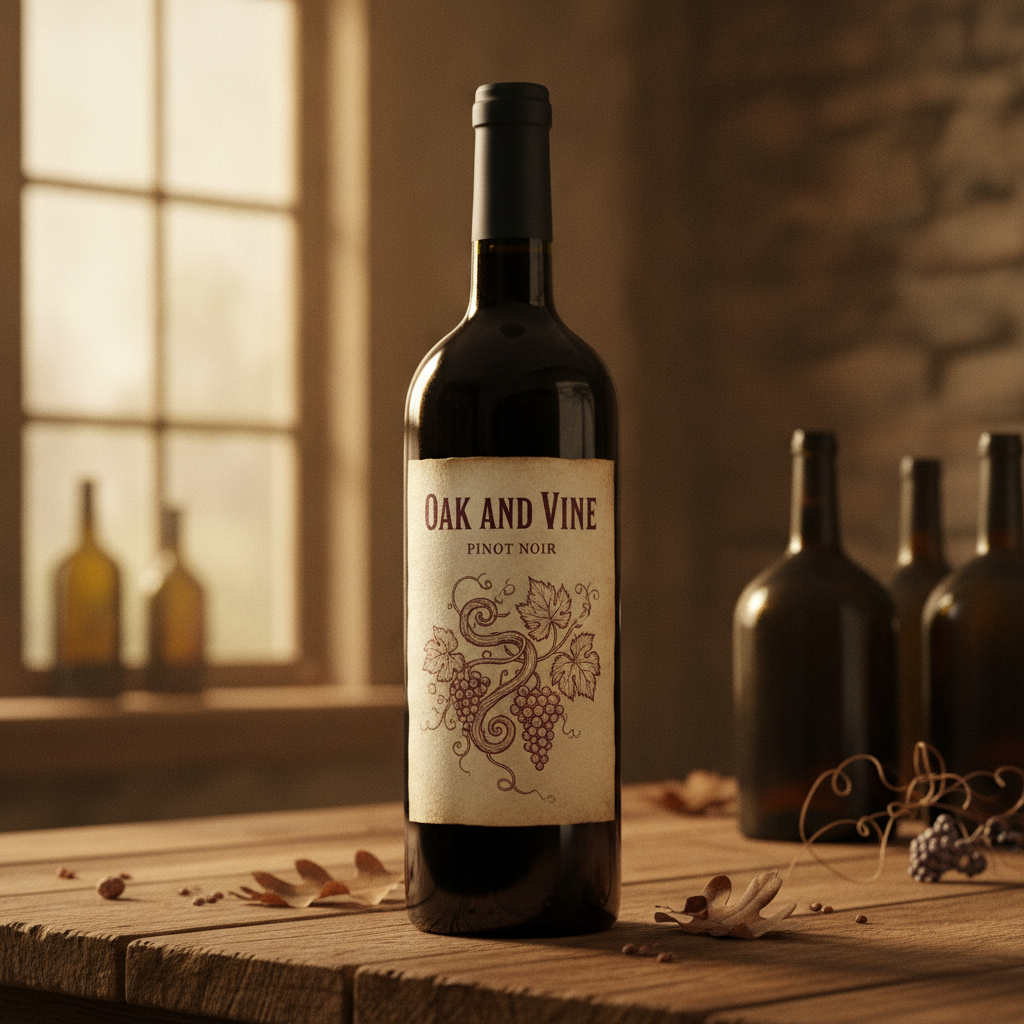
A red wine bottle on a rustic oak table in warm window light, with an old-world label: an engraved line drawing of grapevines, leaves and two bunches of grapes in burgundy ink on aged cream paper, OAK AND VINE across the top in small-cap serif and PINOT NOIR below it. The engraving is the strongest thing on this page — the line weight genuinely reads as intaglio rather than as a filter — and the label wraps the bottle with correct shading down both sides instead of sitting on it like a flat sticker. The problem is the edge. The paper is drawn torn and irregular, softly deckled along the top and stained at the corners, and an irregular edge is not a die line. A converter cuts labels to a defined shape with a tool, so a genuine deckle is either a specified stock or a specified die, and a randomly ragged outline is neither. Read the artwork, redraw the outline as a rectangle with a stated corner radius
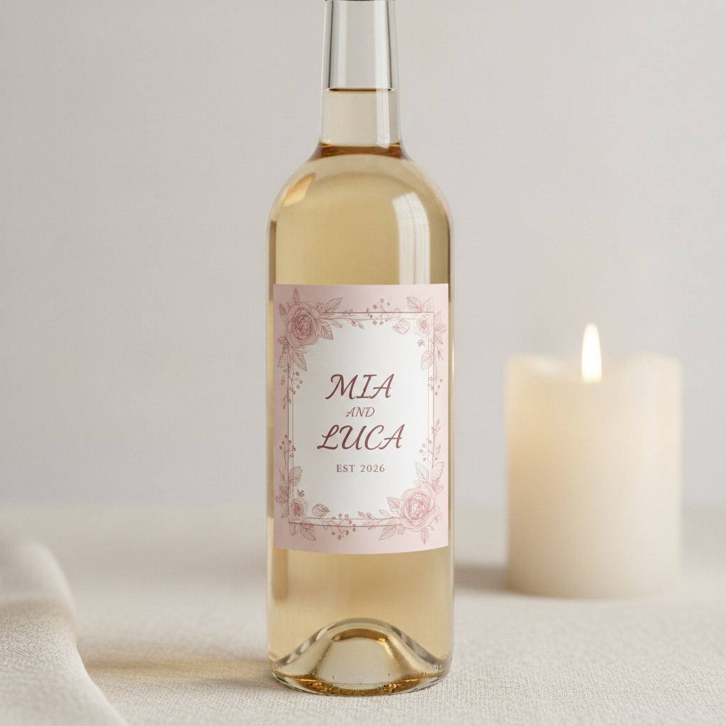
A clear bottle of straw-gold wine beside a lit candle on linen, wearing a custom wedding label: a blush pink field, a fine hand-drawn rose and berry border, MIA AND LUCA set large in the centre and EST 2026 in small capitals underneath. The names and the date are spelled and set correctly, and the border art is genuinely printable. What the render cannot show is how this product actually works. A personalised wedding label is almost always an over-label applied on top of a commercially bottled wine, which means the mandatory text on the bottle underneath — alcohol content, net contents, the bottler line, the Government Warning — has to stay visible after your label goes on. In practice that makes it a front-panel-only job with a size limit set by whatever is already printed on the back, which is a constraint on the artwork rather than an afterthought
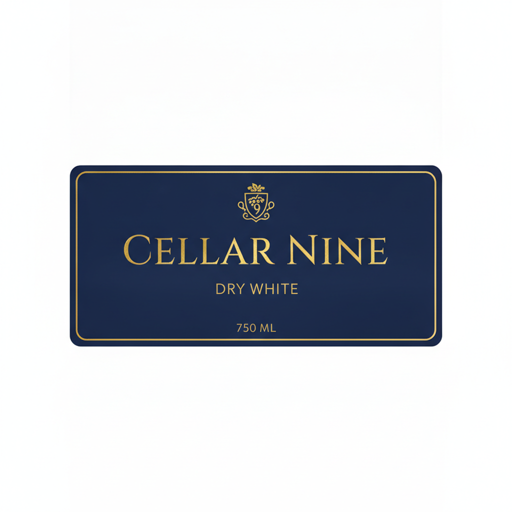
The flat label layout, and the most instructive frame here. Navy field, gold rule, a small grape crest, CELLAR NINE in tall gold serif capitals, DRY WHITE beneath and 750 ML at the foot, all correctly spelled, shown flat with no bottle. It looks like a print file and it is not one. There is no bleed — the artwork stops dead at the rounded rectangle instead of running past it, so a die cutting on that line with its normal drift would shave navy off one edge and leave white on the other. There are no crop or registration marks and no die line drawn as a separate layer. The proportions are landscape and about two to one, wider and squatter than the portrait front panel most 750 ml bottles take. And the gold is a painted gradient: real foil is a stamped metal film that flares as the bottle turns, which is a tooled finishing process quoted on its own, not a colour you can ask for in a prompt
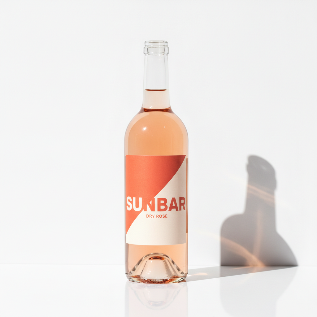
A rosé bottle in hard summer light against white, with a bold modern label split diagonally into coral and cream, SUNBAR in heavy geometric capitals and DRY ROSÉ below. The colour blocking is the best-executed design on the page, the diagonal genuinely bends with the glass rather than sitting flat on it, and the model added the acute accent to ROSÉ that the prompt never asked for — flattering here, and a warning in general, because a generator that quietly corrects your typography will also quietly restyle a brand name you intend to trademark. Then look at the top of the bottle: there is no closure at all. No cork, no capsule, no screw cap, just an open threaded glass mouth on a bottle filled to the neck. The cast shadow on the right is a second failure, detached from the bottle and carrying a shoulder profile that does not match the object throwing it
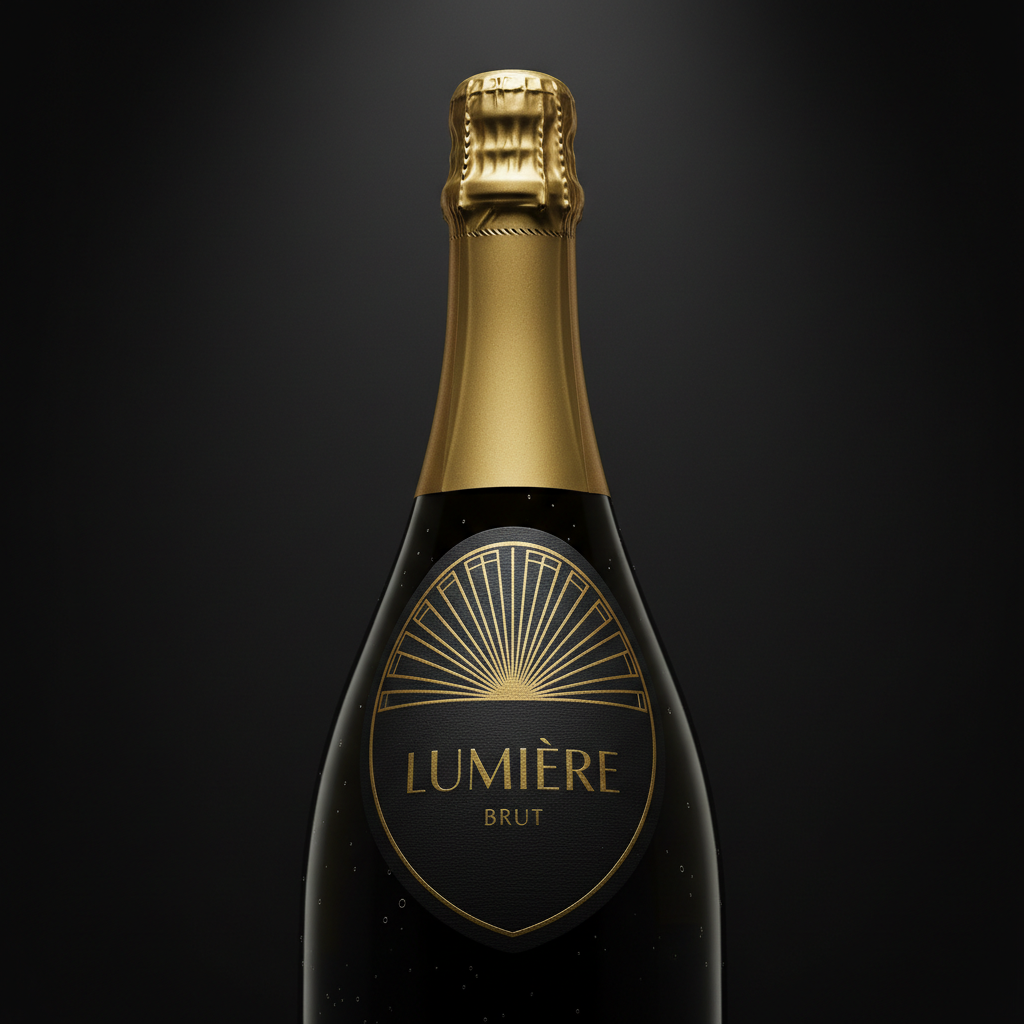
A sparkling wine bottle shot close on a dark background: a shield-shaped label in deep black with an art deco gold sunburst, LUMIÈRE in fine gold capitals — accent added unprompted again — BRUT beneath it, and a matching gold foil covering the neck. As a piece of luxury packaging design it is the most convincing frame on the page, and the shaped label with its pointed foot is a real die shape a converter can cut. The mistake is placement. The label is set high, spanning the shoulder where a champagne bottle curves in two directions at once, and paper does not do that: a label of this height applied there will wrinkle and lift at the sides, which is why real sparkling labels sit on the straight body below the shoulder. The gold is also flat shading rather than metal — it holds the same tone across the whole curve instead of flaring where the light hits
How the AI Wine Label Generator Works
Pick the label style and the bottle
Modern minimal, estate engraving, botanical, a wedding over-label, a flat layout or shaped sparkling foil. Name the bottle shape with it, because a Bordeaux, a Burgundy, a flute and a sparkling bottle each take a different label size and a different placement — and if you leave it out, the model will pick one for you, as the first frame in the gallery shows.
Give it a short brand name and a paper
One or two short common words in capitals is where this model’s lettering is reliable, and all six labels above proved it. Then say the stock and the finish — uncoated textured estate paper, coated white, metallised film — and the palette. Leave the alcohol figure, the volume, the appellation and the bottler line out entirely; the presets refuse them on purpose.
Hand it over with the regulated block attached
Concepts arrive in about twenty seconds at up to 4K. The render settles what the label looks like; you write down what it cannot hold — die size, bleed, corner radius, stock, adhesive, foil and every word of the mandatory text — and a designer or your label printer turns the pair into a file that can be approved and pressed.
What a Wine Label Render Settles, and What It Hides
Six things decide whether a label design can actually be printed, applied and approved, and an image carries about two of them. Knowing which two is the difference between a concept your printer can quote from and a beautiful picture of a bottle that would never clear approval.
Half the label is text you must never generate
Brand name, class or type, alcohol content, net contents, the bottler’s name and address, the sulfite declaration, country of origin on imports and the Government Warning in its exact statutory wording. That block is legally specified, it has its own minimum type size and contrast rules, and a model that invents a percentage or an address has not made a typo — it has made a filing problem. Every preset here refuses it by name and leaves the space instead.
A die line is a shape, not an outline
Labels are cut with a tool to a defined shape with a stated corner radius, and the artwork has to be built to that shape with bleed running past it. The engraved frame in the gallery came back with a torn, irregular paper edge, which looks charming and is not a die a converter can make. Fix the outline as a rectangle, an oval or a specified shaped cut before anything goes near a press.
Bleed and safe margin never survive the render
Bleed is artwork pushed 3 mm or 0.125 inches past the cut line so the die always cuts through ink, and the safe margin is the matching distance inward that type must stay inside. The flat layout above has neither: the artwork stops dead on the cut line, so normal die drift would shave colour off one edge and leave a white sliver on the other.
The bottle decides the label, not the other way round
A 750 ml Bordeaux is about 3 inches across with high square shoulders and a long straight body; a Burgundy slopes away from the neck; a sparkling bottle curves in two directions at the shoulder. Paper only conforms in one direction, which is why the shaped label above would wrinkle where it was placed. Measure the bottle you have actually sourced, then size and place the label to it.
Foil and emboss are tooled processes, not colours
Hot foil stamping, embossing, debossing, screen printing and spot varnish are each quoted, tooled and minimum-ordered separately, and each needs its own spot layer in the artwork. A render shows the impression and none of the substance: the gold on two labels here holds one flat tone across the whole curve, where real foil flares as the bottle turns. Name each finish as a spec and sign off from a physical proof.
Stock and adhesive are a working specification
An uncoated estate paper lightens ink noticeably, a metallised or clear film makes the glass and the wine part of the design, and a white, rosé or sparkling label has to survive condensation and an ice bucket — which means wet-strength stock, a suitable adhesive and often a laminate. Every label in this gallery is perfectly dry, so none of that is visible here. It is a conversation with your label printer.
Brand Names, Small Print and What to Keep Off the Render
A wine label is unusual in this series: some of its text is design and some of it is law, and the two need treating completely differently. Here is the boundary, drawn from what actually rendered on this page.
Safe to render
One or two short common words in capitals, set large, with room around them. Every brand name above came back correctly spelled, as did RED BLEND, PINOT NOIR, DRY WHITE and BRUT, and two four-digit years. If the words are everyday English and they fit on one line, the model will spell them.
Keep out of the render
Alcohol percentages, volumes, appellations, bottler addresses, sulfite and allergen statements, barcodes, e-label codes, award medals and the Government Warning. Digit strings and long lines of small type are the weakest case, and they are also the parts that are legally specified — the worst possible overlap.
It will edit your typography unasked
ROSE came back as ROSÉ and LUMIERE as LUMIÈRE, neither of which was in the prompt. Flattering on a concept, and a genuine problem on a brand name you intend to register, since the string you trademark and the string on the render then differ by a character. Check every letter of a brand name against what you filed.
Do it the way wineries do it
Nobody sets the regulated block inside the artwork. The design is agreed, then the mandatory text is set as real type on its own layer at a specified size in the production file, checked by a person and submitted for approval. Design the label here with the brand name only, leave deliberate clear space, and set the rest where you control every character.
Why Use This AI Wine Label Generator
Six builds, not six colourways
A minimal estate rectangle, an engraved old-world label, a painted botanical, a compact wedding over-label, a flat print layout and a shaped sparkling die are six different jobs with different die shapes, different placements and different costs behind them. Switching preset changes what the label is rather than what shade it happens to be.
The flat layout built into the presets
One preset renders the label flat with no bottle, because a die-cut shape with bleed around it is what a label printer actually receives and it is the thing every bottle mockup hides. It is also a standing reminder to check that the proportions are right and that the artwork runs past the cut line.
The regulated block refused item by item
Alcohol figures, volumes, sulfite statements, bottler lines, appellations, barcodes, award medals and the Government Warning are banned individually rather than with one blanket instruction, which is the difference between a clean concept and a bottle with invented legal text printed across it.
Written as bottle photography
Every preset names a bottle shape, a placement on the glass, a camera angle and a described light, so concepts arrive looking like the shelf or listing photograph a wine eventually needs rather than flat artwork floating on a gradient.
Consistent across a whole range
Nano Banana Pro holds a described palette and illustration style across separate generations, so keeping one colour story while changing only the varietal gives you a range that reads as a single producer rather than six unrelated bottles.
Cheap enough to test the whole shelf
About twenty seconds per concept and plans from $2.99 means you can put six labels in front of a tasting room, a distributor or a customer and find out which one gets picked up, long before a print run with a minimum order attached to it.
AI Wine Label Generator FAQ
Related Label and Packaging Tools
AI Label Generator
The general-purpose version, for candle jars, jam, skincare, spice sets and soap wraps. Use it when the product is not regulated the way wine is and the mandatory block is a net weight rather than a statutory warning.
AI Packaging Design Generator
One step out from the label: cartons, sleeves, gift boxes and the twelve-bottle case a wine ships in. Useful once the label is settled and the package around it needs to match.
AI Mockup Generator
The other direction. Take label artwork you already own and see it applied to a bottle for listing and trade images, where this page is for deciding what the label should be in the first place.
Design Your Wine Label Now
Six label builds, papers and inks that render with the right texture, a flat layout that shows what a label printer actually receives, and 4K bottle shots in about twenty seconds. Free to start, from $2.99 for more.
Start Designing FreeAbout This AI Wine Label Generator
An AI wine label generator is genuinely useful on one part of the job and quietly misleading on the rest, and wine draws that line more sharply than any other product in this series. A label is two documents printed on the same rectangle. One is the design — the paper, the palette, the illustration, the typographic feel, the shape of the die and the finish on top of it — and that is a matter of taste, argued about for weeks, described badly by everyone involved, and settled beautifully by a picture. The other is a block of regulated text that decides whether the bottle can legally be sold: in the United States that means the brand name, the class or type designation, the alcohol content, the net contents, the bottler’s name and address, a sulfite declaration where it applies, country of origin on imports, and the Government Warning in wording fixed by statute. Wine at 7% alcohol or more generally needs a Certificate of Label Approval from the TTB before it moves in interstate commerce, and that approval turns on the second document, not the first. This tool does the first in about twenty seconds and deliberately refuses the second.
That refusal is the design decision worth explaining, because it is unusual. Everywhere else in this series the instruction is simply to keep text off the render because the model spells long strings badly. Here it spells rather well — every brand name in the gallery came back correct, along with the varietals and both four-digit years — and the reason to keep the small print out is different and stronger. A hallucinated alcohol percentage is not a typo; it is a figure with a legal tolerance and a tax bracket attached to it. A plausible-looking bottler address is not a placeholder; it is a false statement on a regulated container. The Government Warning is verbatim statutory text with its own minimum type size and contrast rules, and a model that paraphrases it has produced something worse than nothing, because it looks finished. So every preset on this page names those items individually and refuses them, and leaves deliberate clear space on the label where they belong. That is also how wineries actually work: the design is agreed first, and the mandatory block is set as real type on its own layer in the production file, checked by a person, and submitted for approval.
The six presets are builds rather than colourways, because a minimal estate rectangle, an engraved old-world label, a painted botanical, a compact wedding over-label, a flat print layout and a shaped sparkling die are six different production problems. The over-label is the clearest example: a personalised wedding or gift label goes on top of a wine that has already been bottled and approved, so the mandatory text underneath it has to stay visible, which turns the whole thing into a front-panel-only job with its size set by what is already on the glass. The flat layout is the one worth studying, because it renders the thing every bottle mockup hides — a label file is a flat die-cut shape with the artwork pushed past the cut line on every edge, a separate die line, and any foil or emboss supplied as its own spot layer. Read it sceptically as well as usefully: the version in the gallery has the look of a print file and none of the mechanics, with the artwork stopping dead on the cut line and no bleed at all, and its proportions came back landscape where a real 750 ml front panel is portrait. Layout renders are the most valuable thing you can ask this model for and the easiest to over-trust.
The second thing to carry away is a limit that turns up on every product page in this series and is unusually easy to see on a bottle. The model renders what a surface looks like and invents how the object is assembled. Engraved line work, watercolour on textured stock, uncoated paper fibre and a label wrapping correctly round the curve of glass all come back convincingly. The construction does not: the rosé bottle in the gallery has no closure at all, just an open threaded mouth on a bottle filled to the neck, and a cast shadow that does not match the object throwing it. Neither does anything numerical or physical — die size, corner radius, bleed, safe margin, stock, adhesive, whether the label survives an ice bucket, and the bottle shape itself, which the first frame silently changed from a Bordeaux to a Burgundy. Rendered foil is yellow pixels that will not flare when the bottle turns, and hot foil, emboss, screen print and spot varnish are separately tooled and minimum-ordered processes rather than colours you can request. Treat all of it as a written specification travelling beside the image. Do that and the tool earns its keep: it runs on Nano Banana Pro, which holds a described palette across separate generations so one colour story can carry a whole range, it is free to start with paid plans from $2.99, and it turns the slow, expensive, argumentative stage of launching a wine — deciding what the bottle will actually look like — into six pictures you can put in front of a tasting room long before a print run. Nothing here is legal advice; confirm the current requirements with the TTB or the authority in your market, and let your label printer check the file before it goes on press.