
AI Accent Wall Design Generator
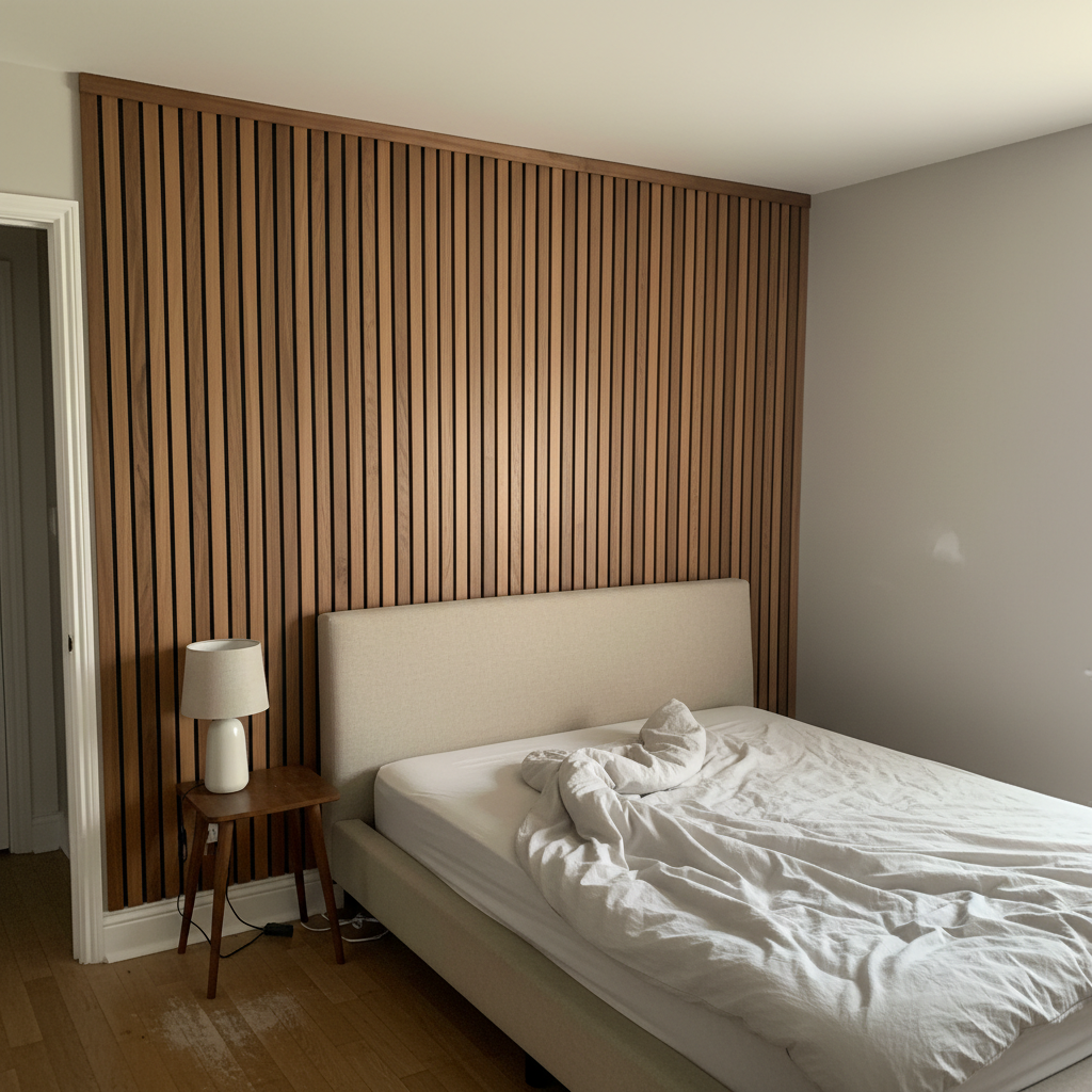
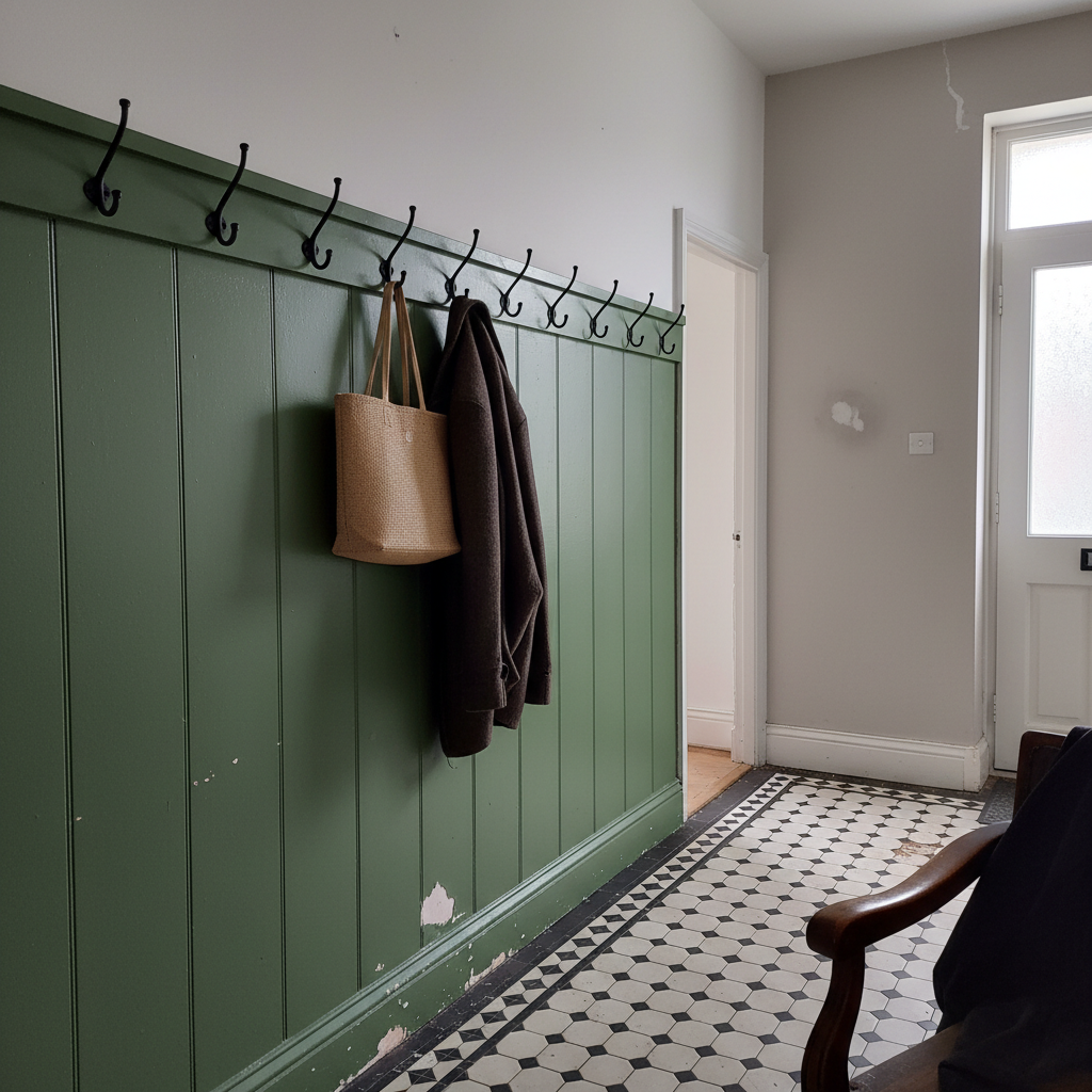
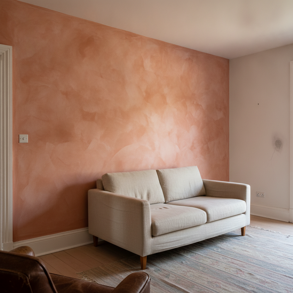
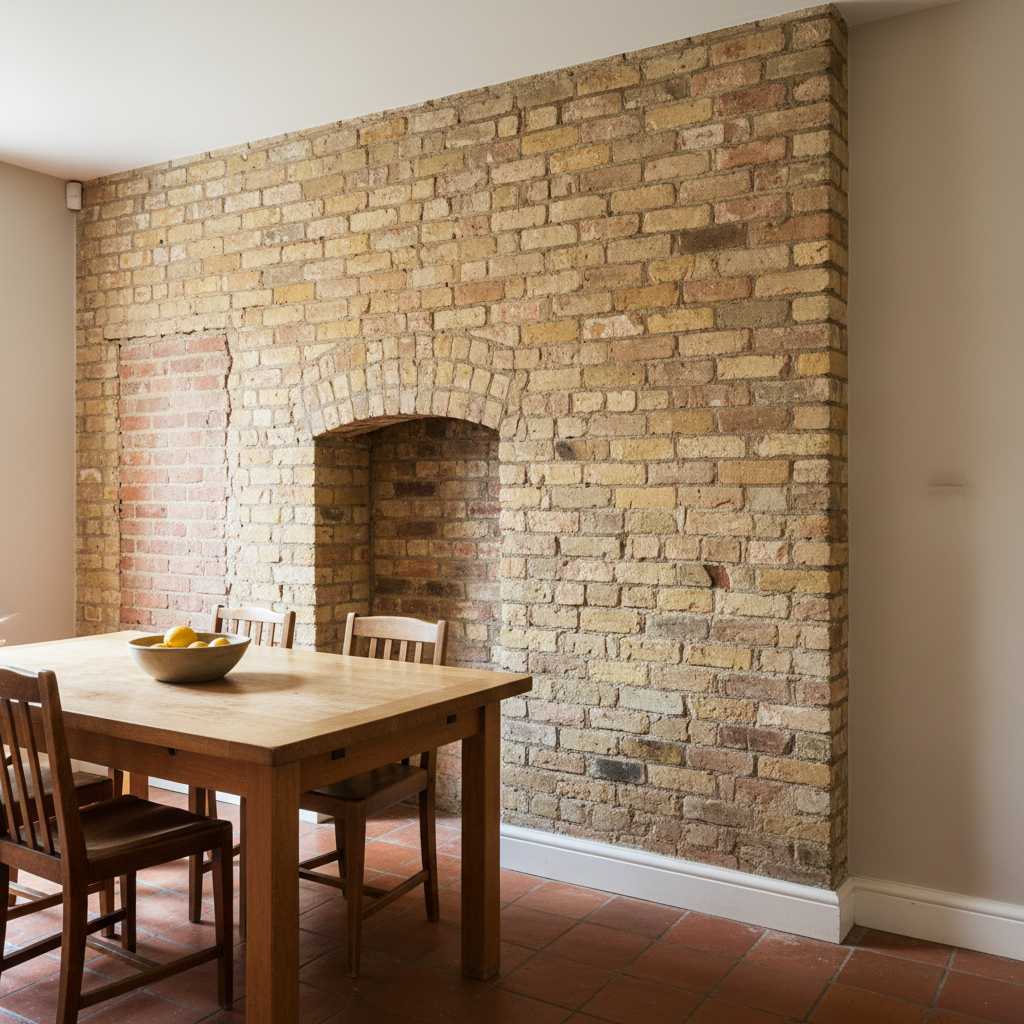
See the wall before you buy the timber. This AI accent wall design generator turns a description into one finished wall photographed inside a real room, in about thirty seconds — a walnut slat wall, a board and batten hallway, a limewash plaster wall, exposed brick, picture frame moulding and a colour-drenched office wall with a built-in desk. All six results are below exactly as they came back, including the board and batten that quietly arrived as tongue and groove.
Design an Accent Wall FreeTry the AI Accent Wall Design Generator — Free
Pick a build, then use the box for what is specific to your room — which wall it is, what the room is for, where the window sits, how high the ceiling is, what colour the other walls are and what furniture stands in front of it. Each preset already carries the one-wall-only clause, the connections written as connections, the wear pinned to named places, the eye-level camera and the no-lettering list, all tightened after reviewing what came back the first time.
AI Accent Wall Design Generator
Choose a finish, name your room, your colours and the furniture in front of it, and get a photorealistic accent wall shot from inside the room. Up to 4K.
Six Builds From the AI Accent Wall Design Generator, Shown Exactly As They Came Back
Nothing here was regenerated or retouched. Each caption says what the prompt asked for and what actually arrived, because the gap between those two is the part nobody publishes.
What the AI Accent Wall Design Generator Gets Right and Wrong
An accent wall is one simple idea with four hard ones hiding inside it — where the treatment stops, what profile the timber actually is, how big anything is, and whether the room is allowed to look lived in — and every result above turns on one of those.
Say where the wall stops, or it eats the room
The default behaviour is to wrap the finish onto every wall in frame. Naming the internal corner, describing the neighbouring wall as plain plaster in a paler colour, and banning the wrap onto reveals and ceiling held it to one wall in all six results. This is the clause to copy first.
Describe the profile, not the trade name
Board and batten came back as tongue and groove. Walnut slats came back correct, because the brief gave slat width and gap width in fingers and put a black backing board behind them. Names of joinery profiles are weak; sections and shadow lines are strong.
The camera stays at eye level on a vertical subject
Six out of six stayed at standing height with the return corner visible, which almost never happens on this site. A wall is vertical, and every prompt put a bed corner, a chair back or a sofa arm close in the foreground and said the frame cut it. That combination also kills the flat catalogue elevation.
Ban the straight edge inside a mottled finish
Limewash, plaster and any cloudy finish normally arrive as a hard-edged rectangle that reads as a patch of different paint. Banning the straight edge, the rectangle and the block inside the pattern itself produced genuinely soft drifts here, and it is the first time this has worked cleanly.
Built-in works when it is written as geometry
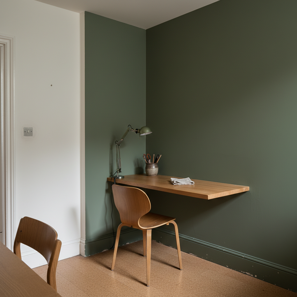
The office desk is let into slots cut in the plaster with no bracket and no leg at the wall end, because the brief described a hole cut through and a body hidden rather than asking for a floating desk. The same wording has now landed a tree in a cut paving slab and a desk in a wall.
Counting and extent still drift, every time
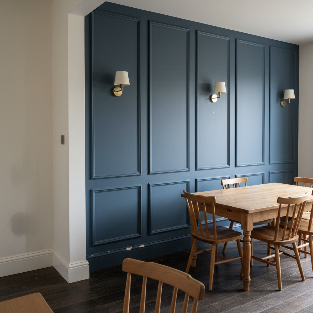
Two wall lights became three, four table legs became three, four mismatched chairs became four matching ones, and a desk specified to run wall to wall came back a third of the width. Ask for what things look like; do not ask for how many there are or how far they go.
How It Works
Pick the finish closest to what you are arguing about
A walnut slat wall, a board and batten hallway, a limewash plaster wall, exposed brick, picture frame moulding or a colour-drenched wall with a built-in desk. Each preset already carries the one-wall-only clause, the skirting and top rail connections, the wear, the eye-level camera and the no-lettering list, so you start from a brief rather than a blank box.
Add what is specific to your room
Which wall it is and what stands against it, the colour of the walls it meets, the ceiling height, which side the window is on, what the floor is, and whether there is a chimney breast, a radiator or a door opening in the way. Describe profiles by their section rather than their trade name, and skip the millimetres — they are ignored.
Generate, crop in, then send it on
About thirty seconds later you have a photograph of the wall built and lived with. Crop in before you judge it — a wrong profile, a blob of filler and a stray sensor on the plain wall are all things you only see at full size — then download up to 4K and send it to a joiner or a decorator for a quote.
Built for the Way People Actually Choose an Accent Wall
One wall, stopping at a real corner
The treatment runs corner to corner and skirting to ceiling on a single wall, then stops dead against plain plaster in a different colour. That corner is in the frame in all six results, which is the only way to tell an accent wall from a redecorated room.
Skirting and top rails that connect
The skirting runs unbroken along the foot of the treatment and turns the corner onto the plain wall, and vertical elements die into a horizontal rail at the top instead of stopping ragged. Nothing floats above the floor and nothing ends in mid air.
Profiles described as sections
Slat width and gap width given in fingers, battens described as strips laid on a flat sheet with a shadow line down each edge, mouldings given an ogee that catches light on top and drops a shadow underneath. Sections survive; trade names do not.
Wear pinned to named places
Chips at knee height where bags swing in, a cap rail chalked where sleeves pass, matt paint rubbed to a sheen above a desk where forearms lean, floor polished pale in the traffic line. Named that way it survives even a dead flat modern scheme.
Nothing lettered, nothing branded
Framed art, book spines, screens, clocks, labels and brand badges on sockets and switches are all deleted as objects rather than as text. All six results came back with no lettering anywhere, which is what makes them usable as a client image.
Rooms that look lived in, not staged
No pampas grass, no arched mirror, no gallery wall, no fiddle leaf fig in a basket, nobody in shot and no decorating job in progress. The default styling kit is banned by name so what you see is the wall, not the props in front of it.
AI Accent Wall Design Generator FAQ
Related Design Tools
AI Living Room Design Generator
One wall is rarely the whole argument. If the sofa, the layout and the floor are still open, design the room first and come back here to decide what happens behind it.
AI Wallpaper Generator
The other way to do exactly this job. Paper is the accent wall that comes off again, so it is worth seeing a pattern on the wall before committing to timber you have to unscrew.
AI Bedroom Design Generator
Where most slat walls end up. Useful for working out how low the headboard needs to sit before the slats above it are worth paying for at all.
See the Wall Before You Buy the Timber
Six builds — walnut slats, board and batten, limewash plaster, exposed brick, picture frame moulding and a colour-drenched wall with a built-in desk — each photographed from inside a real room in about thirty seconds, in your colours and against your floor. Up to 4K. Free to start, from $2.99.
Design an Accent Wall FreeAn AI Accent Wall Design Generator for Homeowners, Decorators and Anyone Staring at One Blank Wall
An accent wall is the cheapest big change a room can have and the hardest one to picture. It is one surface, it is usually the wall you look at from the sofa or lie facing in bed, and the decision is almost always the same: leave it painted, or put something on it. The trouble is that a coat of limewash and a wall of walnut slats take about the same number of words to describe and nothing like the same amount of money to build, and nothing in a showroom shows you either of them in your own room, in your own light, next to your own floor. That is the gap an AI accent wall design generator fills: describe the finish, the profile, where it stops and what stands in front of it, and about thirty seconds later you have a photograph of it built and lived with. Every preset on this page is written that way, and the six results above are shown exactly as they came back, failures included.
The six builds cover the shortlist a real wall actually has. Vertical timber slats over a black backing board, which is what most people mean now when they say feature wall. Board and batten, which is what rescues a narrow hallway that takes a beating. Limewash plaster, which is the cheapest of the six and the one that changes the light in a room most. Exposed brick, which is the only one you cannot undo. Picture frame moulding painted out in a single deep colour, which is what a dining room with decent ceiling height tends to want. And a colour-drenched wall with a desk built into it, because in a small box room the accent wall and the furniture are usually the same decision.
The pattern in what came back matters more than a feature list. The clause that mattered most was the one that keeps the finish on a single wall: naming the internal corner, describing the neighbouring wall as plain plaster in a paler colour, and banning the wrap onto ceilings and window reveals held it to one wall in all six results, and every frame shows the corner where it stops. The camera stayed at standing eye level six times out of six, which is rare on this site and happened because a wall is a vertical subject and because every prompt put a bed corner, a chair back or a sofa arm close in the foreground and said the frame cut it. Banning the straight edge inside a mottled finish finally produced genuinely soft limewash drifts instead of a rectangle of second colour. A desk written as geometry — a slot cut through the plaster, the body hidden — came back properly built in. And the filled-in doorway asked for in the brick wall, pinker bricks with brighter mortar and toothed edges, is the detail that makes that frame look photographed rather than generated.
What failed is narrow, repeatable and worth knowing before you start. Trade names for joinery profiles are weak: board and batten arrived as tongue and groove, while the slat wall that was described by section came back correct. Counting drifts every single time — two wall lights became three, four table legs became three, four mismatched chairs came back matching. Extent drifts too, with a desk specified to run wall to wall arriving at a third of the width, and a room written as tiny reading as a generous corner, because proportion only lands when there is something in frame to measure against. And small blank fittings still survive being banned by name, with a sensor turning up high on a plain wall in one frame. Inside those limits an AI accent wall design generator is a genuinely good half hour before you commit: the slats-against-panelling argument gets settled, the household agrees on something it can point at, and the joiner gets a photograph instead of a paragraph.