
AI Calendar Design Generator
A calendar is a series product with a deadline, not a single poster. Twelve pages have to look like one thing, the date grid has to stay readable from across a room, and the file has to survive bleed, trim and a binding punch. This AI calendar design generator works in six real formats — minimal wall, photo calendar, illustrated seasonal, vintage print, family and year-at-a-glance poster — and gives you a design in about twenty seconds.
Start Designing FreeTry the Calendar Design Generator — Free
Pick the format first, then add your season, palette and subject. Each preset holds open a quiet region for the date grid, because that space is the difference between artwork you can typeset and artwork you have to fight.
AI Calendar Design Generator
Choose a calendar format, describe the season and palette, and get print-ready page artwork at up to 4K
Calendar Designs Made With This Generator
Six formats rather than six colour schemes, generated with the presets above and left completely unedited — wrong numbers included, because the wrong numbers are the most useful thing on this page. Every example here shows the same split: the artwork, the palette, the type and the spatial hierarchy are usable as they stand, and not one grid holds up. The March page kept its heading and its SUN to SAT labels but repeats dates. The desk calendar has two Monday columns. The photo page came back eleven columns wide, the vintage page nine, the children's page six. And the year poster is the extreme case — three misspelled month names, three months twice, three missing — because twelve grids on one sheet is more counting than any image model does. That is the whole workflow in one gallery: generate the page, typeset the dates.
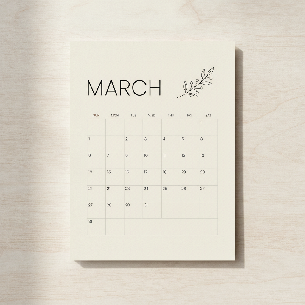
AI calendar design generator result: a minimalist wall calendar page in thin black type on warm off-white paper, a line-art botanical sprig beside the word MARCH and a quiet grid below. The heading and the SUN to SAT column labels came out clean; the numerals inside the grid repeat and run a row too long, which is why the grid is placeholder and the layout is the deliverable
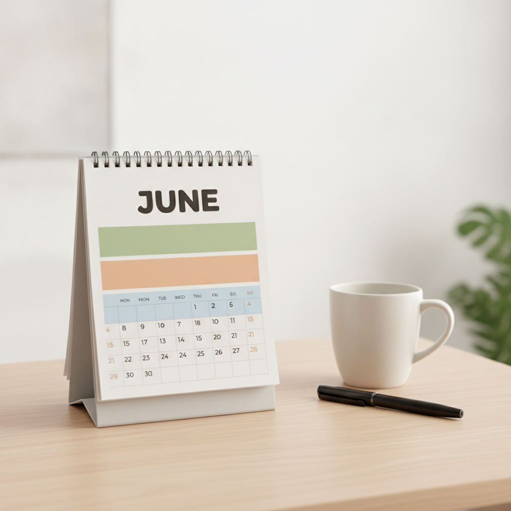
A standing desk calendar on light wood, its page built from sage, apricot and sky blue colour blocks under bold rounded JUNE lettering. The weekday row reads MON twice — a small error to fix in five seconds in a layout tool, and an impossible one to fix inside a rendered image
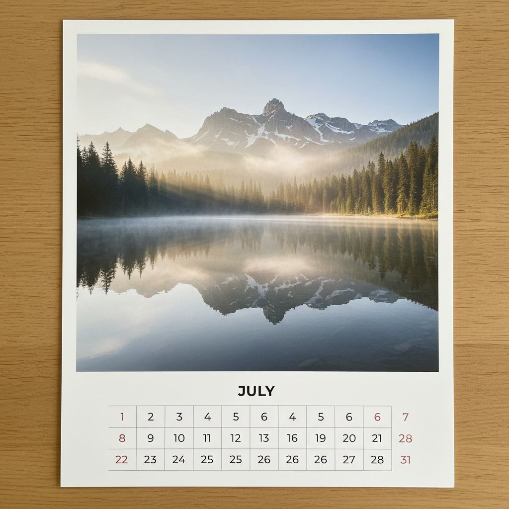
A photo calendar page: a still alpine lake at dawn filling the upper two thirds and a clean white panel carrying JULY and the dates below. The split layout is the point — numerals on plain white rather than fighting a busy photograph — while the grid itself came back eleven columns wide instead of seven
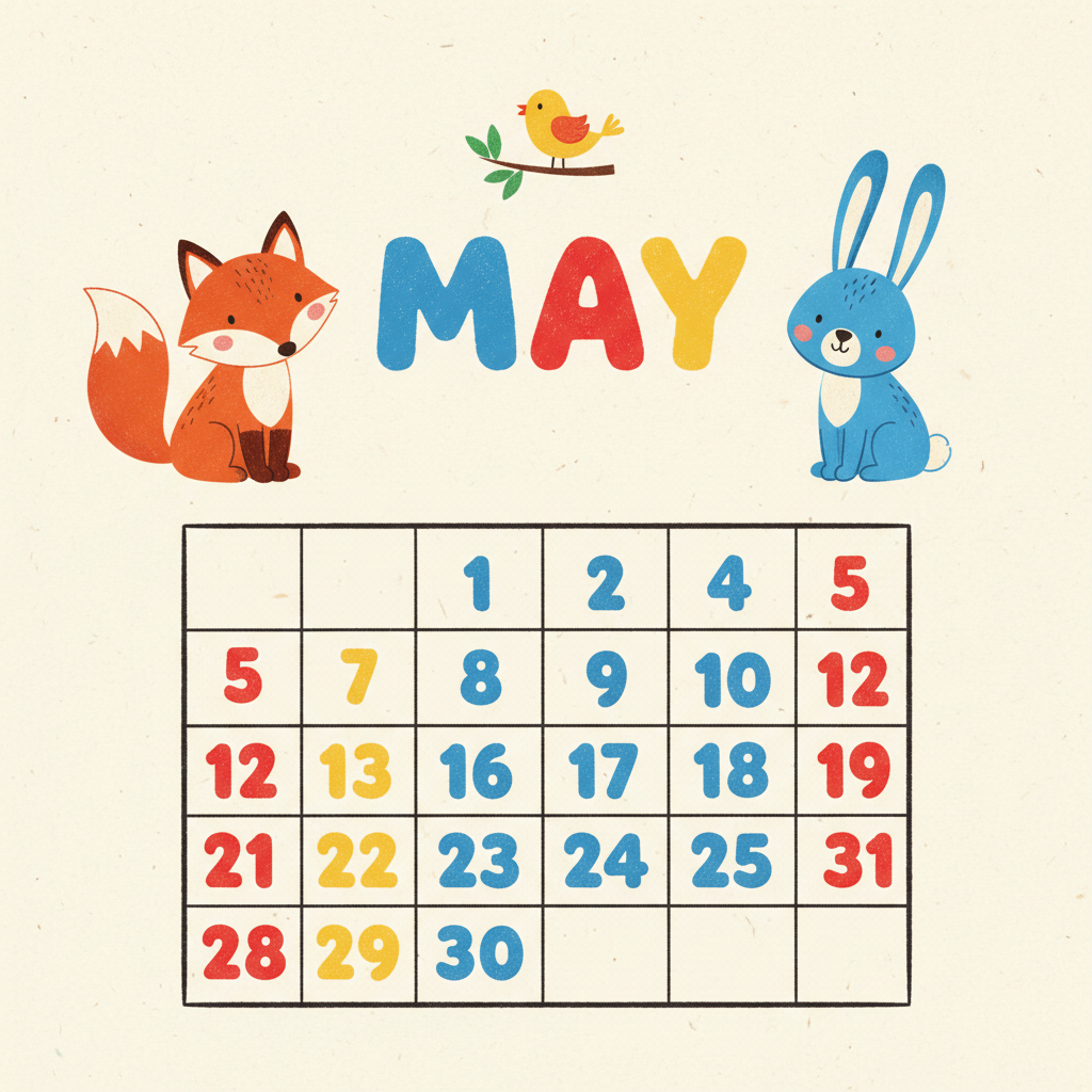
A children's calendar page in bright flat vector style on cream paper: hand-lettered MAY between a cartoon fox, rabbit and bird, over oversized date numerals in roomy cells. The lettering and illustration are usable as they stand; the grid skips numbers and is six columns wide
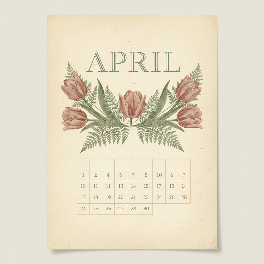
A vintage botanical calendar page on aged cream paper: APRIL in classic serif capitals over ink-and-watercolour tulips and ferns, with a small serif date grid in sage, dusty rose and sepia beneath. The artwork and palette transfer directly to print; the grid arrived nine columns wide
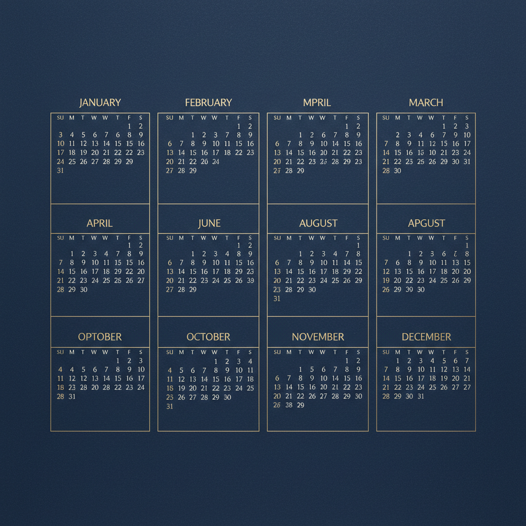
A year-at-a-glance poster: twelve month blocks in fine gold type on deep navy. It is the clearest argument on this page for typesetting dates yourself — the layout, palette and typographic weight are excellent, while three month headings are misspelled, three months appear twice and three are missing altogether
How the AI Calendar Design Generator Works
Pick the calendar format
Minimal wall, photo calendar, illustrated seasonal, vintage print, family or year-at-a-glance poster. The format decides the page proportions, how much room the date grid gets and where the binding will land — which settles far more than any colour choice does.
Describe season, subject and palette
Add the month or season, what should be in the artwork and the colour story. Write it once and reuse the same wording for all twelve months, changing only the subject — repeated language is what makes a set look like one product rather than twelve experiments.
Typeset the real dates over it
Designs arrive in about twenty seconds at up to 4K. Take the artwork into InDesign, Affinity Publisher, Illustrator or Canva, drop in a real generated date table for the year you are printing, add bleed, and check the top strip is clear of the binding punch.
What Actually Decides a Calendar Design
Six constraints separate a calendar from every other print piece. They are why this AI calendar design generator renders formats rather than filters, and why a beautiful page can still be an unusable calendar.
The grid is data, not decoration
A date grid is a specific year's weekday alignment, and it changes every year: February 2027 starts on a Monday with 28 days, February 2028 on a Tuesday with 29. No image model has a calendar inside it, so whatever numerals come back are grid-shaped placeholder. Treat the render as the artwork layer and generate the real grid as live text in a layout tool, where it can be checked against the actual year and reused across the whole set.
Twelve pages, one product
Nobody sees a calendar page in isolation. They see it hanging in the same spot for a month, then replaced by the next one, twelve times. Variation between pages that would look rich in a portfolio reads as inconsistency on a wall. Fix the skeleton first — identical margins, heading position and grid footprint — hold one palette across the year, and let the season be the only thing that moves.
The numerals have to win
Date numbers are small, read across a room, and written on with a pen. They need genuine contrast against whatever sits behind them and a background quiet enough to take biro. The layouts that work are the split page, the full-bleed page with a deliberately pale region held open, and the facing-page spread. The layout that fails is a grid dropped over a busy mid-tone photograph — the most common mistake in home-made photo calendars.
Bleed, trim and the binding punch
Print wants about 3mm of artwork past the trim on every edge, nothing important within 5mm of the edge inside it, and — on a wall calendar — a clear strip of 10mm to 20mm across the top where the wire-o binding and hole punch land. Design a full-bleed image right up to the page boundary and it comes back with a white sliver on one edge or a punched hole through the top of the illustration.
300 DPI decides your page size
Print quality is 300 DPI at final trim, so a 4K render of roughly 3,840 pixels gives you about 12.8 inches on the long edge. That is comfortable for A4, US Letter and any desk format, and tight for A3, where you either upscale or accept around 220 DPI. Decide the finished size before you generate, not after — it is the one constraint that cannot be fixed in the layout stage.
RGB glows, CMYK does not
Saturated oranges, electric blues and bright greens on your screen have no ink equivalent, and they dull on conversion — most visibly in the large flat areas and smooth gradients calendar artwork is full of. Uncoated stock dulls them further. Convert to CMYK yourself and look at the result, or ask for a proof, or design in the mid-saturation palette that most of the printed calendar market already uses for exactly this reason.
Why Use This AI Calendar Design Generator
Six formats, not six filters
The presets differ in page proportion, how much room the grid gets and where the artwork stops — minimal wall, photo, illustrated, vintage, family, year poster — so changing preset changes what the calendar is for, not just what colour it is.
Grid space is held open
Every preset composes around a reserved region for the date grid and keeps a clear strip across the top for the binding, so the artwork you get back is artwork you can typeset over rather than artwork you have to crop and fight.
Built for twelve-page sets
Nano Banana Pro holds a described style across separate generations, so reusing the same prompt wording and changing only the season gives you twelve pages that read as one product — the part of calendar design that actually takes the time.
4K for print
Downloads reach roughly 3,840 pixels on the long edge, which is 300 DPI at about 12.8 inches — enough for A4 and Letter wall calendars, desk calendars and greeting-card-sized formats without an upscaling round.
Portrait and landscape
Wall calendars are portrait, desk calendars are landscape, and year posters are either. The aspect ratio is set per generation, so you can design a matching wall and desk pair in the same style instead of cropping one into the other.
Cheap enough to test concepts
Calendars are a seasonal business with a hard October deadline. About twenty seconds per page and plans from $2.99 means testing three concepts across a few months costs less than committing a print run to the first idea that looked good.
AI Calendar Design Generator FAQ
Related Design Tools
AI Poster Generator
The same print problem without the grid. Useful when the year-at-a-glance layout is really a poster with dates on it, and when you want the wall piece that hangs beside the calendar to match it.
AI Greeting Card Generator
The other seasonal print product, on the same October deadline. Card and calendar sets sell together, and holding one palette across both is what makes them look like a range.
AI Wall Art Generator
Where a calendar page ends up once the year is over. Handy for testing whether an illustration style survives being looked at every day for a month before you commit twelve of them.
Design Your Calendar Now
Six calendar formats, grid space held open, portrait and landscape pages and 4K downloads for print. Free to start, from $2.99 for more.
Start Designing FreeAbout This AI Calendar Design Generator
An AI calendar design generator has to solve a series problem before it solves a decorative one, because a calendar is not a poster with numbers on it. It is twelve pages seen one at a time over a year, hanging in the same spot on the same wall for a month each, and the thing that makes a set look professional is not how striking any single page is — it is how completely the twelve agree with each other. Variation that would read as range in a portfolio reads as carelessness on a kitchen wall. That is why the six presets here are written as formats rather than styles: minimal wall, photo calendar, illustrated seasonal, vintage print, family and year-at-a-glance poster. Changing preset changes the page proportion, the amount of room the date grid gets and where the artwork has to stop, which are the decisions that actually carry across all twelve pages.
The constraint that catches people out is that a calendar page is two layers with completely different natures. The artwork is a design problem. The date grid is a data problem — a specific year's weekday alignment that changes annually, with February 2027 starting on a Monday and February 2028 on a Tuesday with an extra day. No image model contains a calendar, so any grid it draws is grid-shaped placeholder, and any month name or weekday heading is a shape rather than a spelled word. This is not a reason to avoid generating calendar artwork; it is a reason to keep the two layers separate from the start. Generate the artwork here, then typeset a real date table over it in InDesign, Affinity Publisher, Illustrator or Canva, where the grid can be checked against the actual year and swapped between a Sunday-start version for the United States and a Monday-start version for most of Europe without touching the design.
Print sets the rest of the rules, and they are unforgiving because a calendar is printed once in quantity. Artwork needs about 3mm of bleed past the trim on every edge, nothing important within 5mm of the edge, and on a wall calendar a clear strip of 10mm to 20mm across the top where the wire-o binding and hole punch land. Quality is 300 DPI at final trim, so a 4K render of roughly 3,840 pixels gives you about 12.8 inches on the long edge — comfortable for A4, US Letter and desk formats, tight for A3. Colour shifts on the way to ink: saturated oranges, bright greens and electric blues have no CMYK equivalent and dull on conversion, most visibly in the large flat areas and smooth gradients that calendar artwork tends to be made of. And the numerals have to win wherever they land, which means a reserved quiet region rather than a hopeful one — the classic failure being a date grid dropped over a busy mid-tone photograph.
This calendar design generator runs on Nano Banana Pro, the same image model behind the rest of the tools on this site, and the capability that matters most for calendar work is style consistency across separate generations: describe a medium, a palette and a level of detail once, reuse that wording for all twelve months, and change only the season and the subject. That is what turns an evening into a full twelve-page set instead of twelve unrelated pictures. Designs arrive in about twenty seconds at up to 4K, in portrait for wall pages or landscape for desk formats, so a matching wall-and-desk pair is one more generation rather than a crop. It is free to start and paid plans begin at $2.99 — which, against a seasonal market where most calendars sell between October and December, means you can test three concepts properly before committing a print run to the first one that looked good on screen.