
AI Notebook Cover Design Generator
A notebook cover is one flat printed sheet wrapped around a page block, and almost every decision that makes it printable is a number. This AI notebook cover design generator settles the part a picture can settle — artwork, palette, material and finish — and is straight with you about the trim size, the spine width and the bleed it quietly leaves out.
Start Designing FreeTry the AI Notebook Cover Design Generator — Free
Pick the binding first, because it decides what surface you are designing on, then name the material, the artwork and the finish. Every preset is written as stationery product photography rather than flat artwork, and every preset refuses titles, imprints, barcodes and known stationery trade dress, because a cover is the surface lettering turns up on uninvited.
AI Notebook Cover Design Generator
Pick a binding, describe the material and artwork, and get notebook cover product shots at up to 4K
Covers Designed With This AI Notebook Cover Design Generator
These came from the presets above, flaws included, and the captions say what each one gets right and what it quietly invents. The fourth is not a finished notebook at all but the cover laid out flat and unfolded, because that sheet — back panel, spine, front panel, plus bleed — is what a printer actually receives. It is also the frame that failed most usefully: the spine strip went missing and the bleed came back as a bare margin. Read the set for artwork, material and finish. Treat every dimension, every spine width and every edge as a number for whoever prints it.
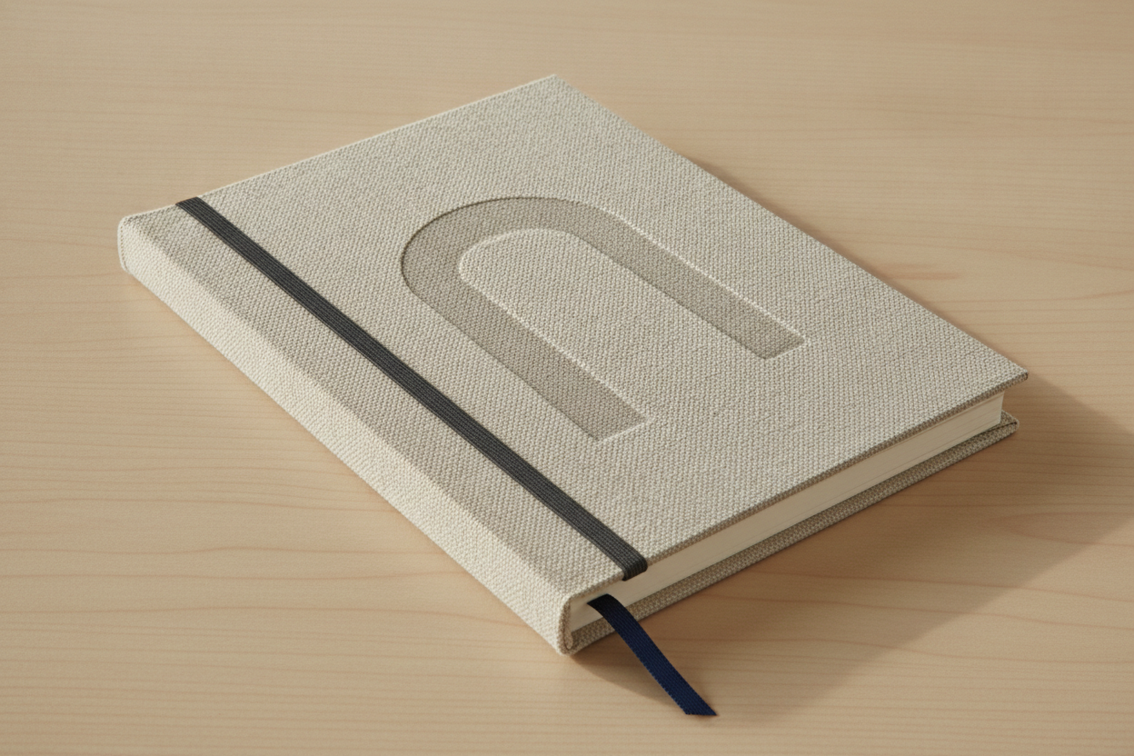
AI notebook cover design generator result: a case-bound hardcover notebook in coarse oatmeal linen bookcloth on a pale oak desk, with a blind-debossed arch motif, a charcoal elastic band and a navy ribbon marker. The bookcloth is the part that convinces, a real woven slub with the light catching individual threads, and the rounded square spine, the cream page block and the ribbon leaving the tail edge are all built the way a case binding actually is. Two things are wrong in ways worth knowing. The elastic sits about two centimetres from the spine instead of near the fore-edge, where an elastic has to sit to hold anything shut — as drawn it would keep the book open rather than closed. And look at the arch: the linen weave runs straight through the impression undisturbed, whereas a real blind deboss crushes and stretches the cloth into the die, which is the difference between a finish and a picture of one
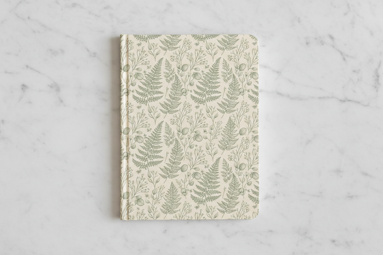
A matte softcover notebook shot straight down on marble, printed edge to edge with fine line-drawn ferns, eucalyptus and seed heads in sage on bone. The matte laminate brief held exactly: no highlights, no reflections, no gloss anywhere, and the line work stays crisp at the smallest seed head. What it is not is a repeat. Every fern on this cover is drawn once and placed by hand, so there is no tile, no repeat unit and no way to run the artwork onto a second product or a longer sheet without the seams showing. It is a picture of a pattern rather than a pattern. The left edge also softens into a rounded fold instead of the flat glued spine that was asked for, so the binding in the frame is not the binding in the prompt
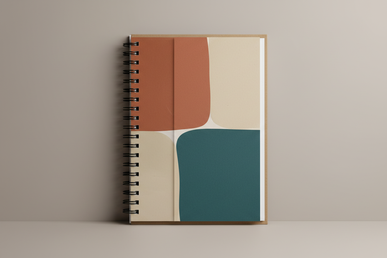
A wire-O notebook leaning against a studio wall, and the frame where the preset failed at precisely the thing it was written to demonstrate. The instruction was that the artwork must begin well clear of the coil; instead the terracotta block runs straight into the punched edge and disappears under the loops, which on a real wire-O means the left strip of your design is punched through and swallowed by the binding. The loops themselves are open hooks rather than closed twin loops, they sit on the surface rather than passing through visible punched holes, and the white page block projects past the cover on the fore-edge, which is backwards — covers are cut larger than the paper, not smaller. The abstract colour blocking and the uncoated paper texture are genuinely good; the binding is decoration
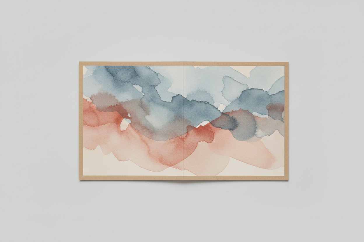
The unfolded full-wrap layout, and the most instructive frame on the page. This is what a cover file actually is: one flat sheet carrying back panel, spine and front panel, printed as a single piece before it is trimmed and folded. The watercolour does run unbroken across the whole sheet, which is the hard part and which the model got right. Two things it got wrong are exactly the two that stop a file printing. There is one centre crease rather than two, so the spine strip is simply missing — the panels meet edge to edge and the width that should have been calculated from the page count is not there at all. And the plain kraft border around the artwork is the reverse of bleed: real bleed is artwork pushed past the trim line so the blade always cuts through ink, whereas here the ink stops short and the bare card would show as pale slivers along every trimmed edge
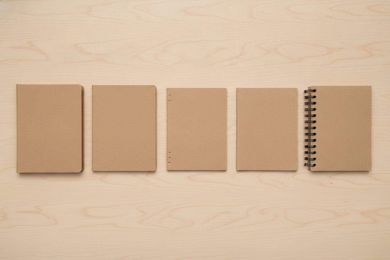
The binding comparison row: five identical blank kraft notebooks were specified, differing only in binding, and what came back is a lesson in reading comparison renders sceptically. The saddle-stitched booklet in the middle is correct, with two wire staples visible on the folded edge, and the hardcover on the left has its rounded square spine. After that it falls apart. The disc-bound notebook that was asked for in the fifth slot does not exist; the wire-O has drifted into its place, bound with a single round spiral rather than twin loops that sit on the cover instead of through it; and books two and four are now visually identical, so the pair that should have contrasted a glued spine with a mechanical one contrasts nothing. The sizes and gaps are uneven too. The deeper mistake is mine rather than the model. Binding lives in the spine, and this was shot from directly overhead, where a spine is the one thing you cannot see
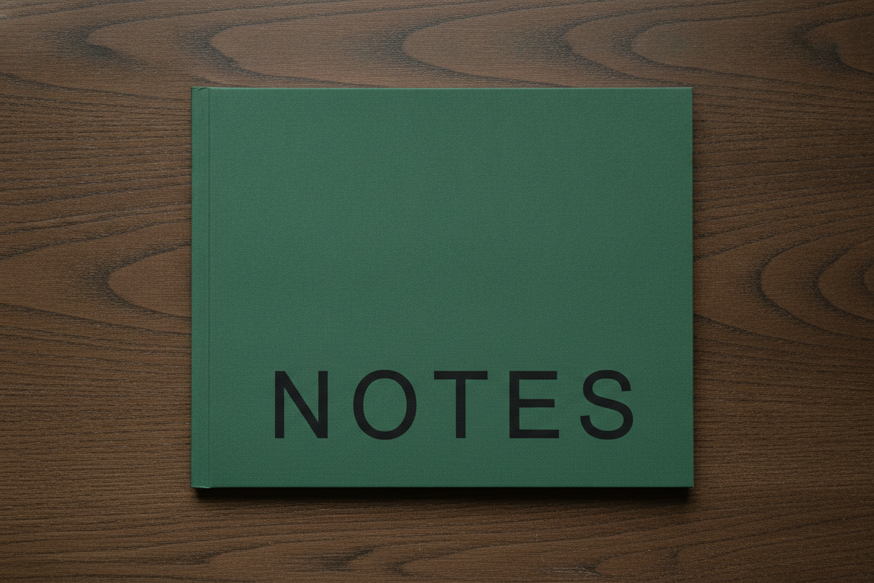
A plain green softcover carrying the single word NOTES, spelled correctly on the first attempt in five evenly spaced capitals. Five common capitals set large and alone on a clear surface is the safe end of what this model does with type, and a real book title, a subtitle, a year or an author name is where it starts doubling and inventing letters. Two specifications drifted quietly, which is the useful part. The deep forest green came back a lighter sage pine, the same colour substitution that turns a specified charcoal into slate blue elsewhere in this series. And the notebook is landscape, because orientation was never stated in the prompt — a reminder that trim size and orientation are specs you write down, not things a render decides for you. The word also sits lower and further right than centred, close enough to the trim edge that on a real print run it would need moving in
How the AI Notebook Cover Design Generator Works
Pick the binding
Case-bound hardcover, perfect-bound softcover, saddle stitch, wire-O or disc. That one choice decides whether you have a printable spine at all, whether the book opens flat, what the page count has to be and how much of the binding edge you lose — far more of the design than the artwork ever will.
Name the material, artwork and finish
Say the stock and the surface — linen bookcloth, uncoated kraft, matte or gloss lamination — then the artwork and palette, then the orientation and trim size. Orientation especially: leave it out and the model will choose one for you, as the landscape cover in the gallery above shows.
Hand it over with the numbers attached
Concepts arrive in about twenty seconds at up to 4K. The render settles what the cover looks like; you write down the four things it cannot hold — trim size, page count, calculated spine width and bleed — and a designer or a printer turns the pair into a flat file that presses.
What a Notebook Cover Render Settles, and What It Hides
Six things decide whether a cover design can actually be printed and bound, and an image carries about two of them. Knowing which two is the difference between a concept a printer can quote from and a beautiful picture of a notebook that no press can reproduce.
The deliverable is a flat wrap, not a photograph
A printer receives one unfolded sheet with the back panel, the spine and the front panel side by side in a single continuous artwork, at trim size plus bleed, at 300 DPI. What you get here is a photograph of a finished object. The unfolded preset exists to show what the real file looks like, and even it dropped the spine — treat the render as the approved concept and rebuild the layout flat.
Spine width is arithmetic and it is invisible
Spine width is page count multiplied by paper caliper — about 0.002252 inches per page on KDP white, 0.0025 on cream — so a 120-page notebook needs roughly 0.27 inches and a 300-page one needs nearly 0.68. A render has no page count inside it, so it either omits the spine or invents a width. Decide pages and paper first, run the printer’s calculator, and carry that number in writing.
Bleed and safe margin never survive the render
Bleed is artwork deliberately pushed past the trim line so the blade always cuts through ink, typically 0.125 inches on every outer edge. The unfolded layout on this page did the opposite and left a bare border, which would print as pale slivers along every trimmed edge. The same applies inward: trimming has a tolerance of a millimetre or two, so keep type and anything you cannot lose well inside the line.
The binding edge eats part of your design
On wire-O, spiral and disc binding a strip down the left edge is punched through and covered by hardware, and nothing important can live there. The wire-O frame above ran its artwork straight into the coil, which is exactly the mistake a real file makes. Saddle stitch has no spine to print at all, and case binding needs extra wrap for the turn-in around the boards.
Finishes are separate processes, not colours
Foil, blind deboss, spot UV, edge painting and lamination are tooled, quoted and minimum-ordered on their own. A render shows the impression of all of them and the substance of none: the debossed arch above has linen weave running undisturbed through it, and rendered foil is yellow pixels that will not catch the light when the book moves. Name each one as a finishing spec and confirm it on a physical proof.
A pattern in a render is not a repeat
The botanical cover above is beautiful and untileable: every motif is placed once, so there is no repeat unit whose edges match. That is fine for one cover at one size and useless the moment you want the same design across a range, on a matching product, or printed onto roll stock. If you need a true repeat, build the tile properly and use the render as the style reference.
Titles, Imprints and What to Keep Off the Render
A cover is the most text-hungry surface in this whole series, and lettering is exactly where this model is weakest. Here is the boundary, drawn from what actually rendered on this page.
Safe to render
One short common word in large plain capitals. NOTES on the green cover above is the pattern to copy, and IDEAS, JOURNAL, PLANNER and DIARY behave the same way. Five or six letters, set large, on one line, with nothing else competing for the same surface. If the word is everyday English and it fits on one line, the model will spell it.
Keep out of the render
Real book titles, subtitles, author names, imprints, volume numbers, years, ISBNs and barcodes. Digit sequences are the weakest case of all, which matters here because a printed notebook usually carries a barcode on the back panel. Long strings come back with letters doubled, dropped or invented outright.
Do it the way publishers do it
Nobody sets cover type inside the artwork. The image is made, and the title, the spine text and the barcode block are set separately in a layout tool at the production stage, on their own layer. Design the cover blank here, leave deliberate empty space where the type belongs, and set the words where the spelling, the font licence and the position are all yours.
Brand trade dress finds its own way in
Ask for a notebook and the model drifts toward the handful of famous ones: the black rounded rectangle with an elastic and a ribbon is an entire brand’s identity, not a generic notebook. The presets here refuse those makers and any licensed character by name, which is why nothing on this page carries one.
Why Use This AI Notebook Cover Design Generator
Six builds, not six colourways
A linen case binding, a matte perfect-bound softcover, a wire-O front panel, an unfolded print layout, a binding comparison and a short-title cover differ in construction, cost and what you are even allowed to design on. Switching preset changes what the object is rather than what shade it happens to be.
The print layout built into the presets
One preset renders the cover flat and unfolded — back panel, spine, front panel — instead of another finished notebook, because that sheet is what a printer actually receives and it is the thing every mockup hides. It is also a standing reminder to check that the spine exists and that the ink runs past the trim.
Written as product photography
Every preset names a surface, a camera angle and a described light, so concepts arrive looking like the listing photograph a stationery product eventually needs rather than flat artwork floating on a gradient.
Cover lettering refused item by item
Titles, author names, imprints, barcodes, ISBNs, price stickers, belly bands and known stationery trade dress are banned individually rather than with one blanket instruction, which is the difference between a clean cover and a concept with invented words printed across it.
Consistent across a whole range
Nano Banana Pro holds a described palette across separate generations, so keeping one colour story and one material while changing only the binding gives you a stationery collection that reads as a single line rather than six unrelated notebooks.
Cheap enough to test the whole range
About twenty seconds per concept and plans from $2.99 means you can put six covers in front of an audience, or test which one gets saved most, before committing to a print run with a minimum order attached to it.
AI Notebook Cover Design Generator FAQ
Related Print and Cover Design Tools
AI Book Cover Generator
The nearest neighbour and a genuinely different job. A book cover has to sell a story in a thumbnail — genre signals, a title, an author name — where a notebook cover sells a blank object on material and pattern alone.
AI Pattern Generator
Where to go when the cover artwork needs to be a repeat rather than a one-off placement, or when the same design has to run across a whole stationery range instead of a single printed panel.
AI Mockup Generator
The other direction: take artwork you already own and see it on a product. Useful once the cover file exists and you need listing images, where this page is for deciding what the cover should be in the first place.
Design Your Notebook Cover Now
Six notebook builds, materials that render with the right texture, an unfolded print layout that shows what a printer actually receives, and 4K product shots in about twenty seconds. Free to start, from $2.99 for more.
Start Designing FreeAbout This AI Notebook Cover Design Generator
An AI notebook cover design generator is genuinely useful on one part of the job and quietly misleading on the rest, so it is worth drawing the line before you start. A notebook is four decisions stacked on each other. The first is the binding, which is really a decision about what surface exists: a case-bound hardcover gives you a printed or clothbound wrap over rigid boards and a real spine, perfect binding glues the block into a flexible cover and gives you a flat spine that needs enough pages to exist at all, saddle stitching staples folded sheets through the crease and gives you no spine and a page count that must divide by four, and wire-O or disc binding opens completely flat while punching a strip out of your artwork and covering it with hardware. The second is the material and the finish: linen bookcloth, uncoated kraft, matte or gloss lamination, foil, deboss, spot UV. The third is dimension — trim size, orientation, page count and the spine width those two produce. Only the fourth, what the cover actually looks like, is something a photograph can settle, and it happens to be the part everybody argues about hardest and describes worst. That is what this tool does in about twenty seconds.
That is also why the six presets here are builds rather than colourways. A linen case binding with a blind deboss, a matte laminated botanical softcover, a wire-O panel with a coil down one edge, an unfolded print wrap, a row of five bindings and a plain cover carrying one short word are six genuinely different objects with different costs, different minimum orders and different production files behind them. Recolouring one of them from sage to plum is a much smaller decision than switching between them. The unfolded preset is the one worth understanding, because it renders the thing every other mockup hides: a cover file is a single flat sheet with the back panel, the spine and the front panel laid out side by side, artwork running continuously across all three, pushed past the trim line on every outer edge so the blade cuts through ink rather than paper. It is worth reading sceptically as well as usefully, because that frame came back with one crease instead of two — the spine strip missing entirely — and with a bare border where the bleed should have been. Comparison and layout renders are the most valuable things you can ask this model for and the easiest to over-trust, so count what is in the picture rather than what was in the prompt. The five-binding row makes the same point twice over: it dropped the disc-bound notebook, drifted the wire-O into its place and left two of the five looking identical.
The most useful thing to know about this AI notebook cover design generator is where its text rendering stops, because a cover invites type more than any other surface in this series. Short common words are safe. The single word NOTES on the green cover above is the pattern to copy, and IDEAS, JOURNAL, PLANNER and DIARY behave the same way: one word, five or six letters, set large in a plain face with nothing competing for the same surface. Real titles, subtitles, author names, imprints, volume numbers, years, ISBNs and barcodes are a different matter, and digit strings are the worst case of all, which matters because a notebook sold through any retail channel carries a barcode on the back panel. The fix is the one every publisher already uses. Nobody sets cover type inside the artwork: the image is made, and the title, the spine text and the barcode block are set separately in a layout tool on their own layer at the production stage. So design the cover blank here, leave deliberate empty space where the type belongs, and set the words in a file where you control the spelling and the font licence.
The second thing worth carrying away is a limit that turns up on every product page in this series, in a form that is unusually easy to see on stationery. The model renders what a surface looks like and invents how the object is put together. Linen weave, matte lamination with no reflections at all, uncoated fibre texture and fine printed line work all come back convincingly. The construction does not. The elastic on the hardcover sits where it could never hold the book shut, the debossed arch has undisturbed weave running through it, the wire-O loops rest on the cover rather than passing through it, and the page block projects past the boards instead of sitting inside them. The same blindness covers everything numerical: trim size, orientation, page count, spine width, bleed and the safe margin are all decisions a render simply does not contain, and one of them — orientation — will be silently chosen for you if you leave it out. Treat all of them as a written specification that travels beside the image rather than inside it. Do that and the tool earns its keep. It runs on Nano Banana Pro, which holds a described palette across separate generations, so one colour story can carry a whole stationery line; it is free to start and paid plans begin at $2.99; and it turns the slow, expensive, argumentative stage of a printed product — deciding what the thing will actually look like — into six pictures you can put in front of a customer long before you commit to a print run.