
AI Infographic Generator
An infographic is only useful if you can read it. That is exactly where most image tools fall apart — they paint something chart-shaped with scrambled letters where the labels should be. This AI infographic generator runs on Nano Banana Pro, which renders real, legible type, so your headings, percentages, axis labels and step numbers come out as the words and numbers you asked for. Describe your data, pick a layout, and get a finished 4K graphic in about twenty seconds.
Try It Now — Free
Pick the layout that matches your information, type in your actual numbers and labels, and click Generate. Your infographic comes back in about twenty seconds at up to 4K.
AI Infographic Generator
Choose an infographic layout, add your real data and labels, and generate a print-ready graphic instantly
Infographics Made With This AI Infographic Generator
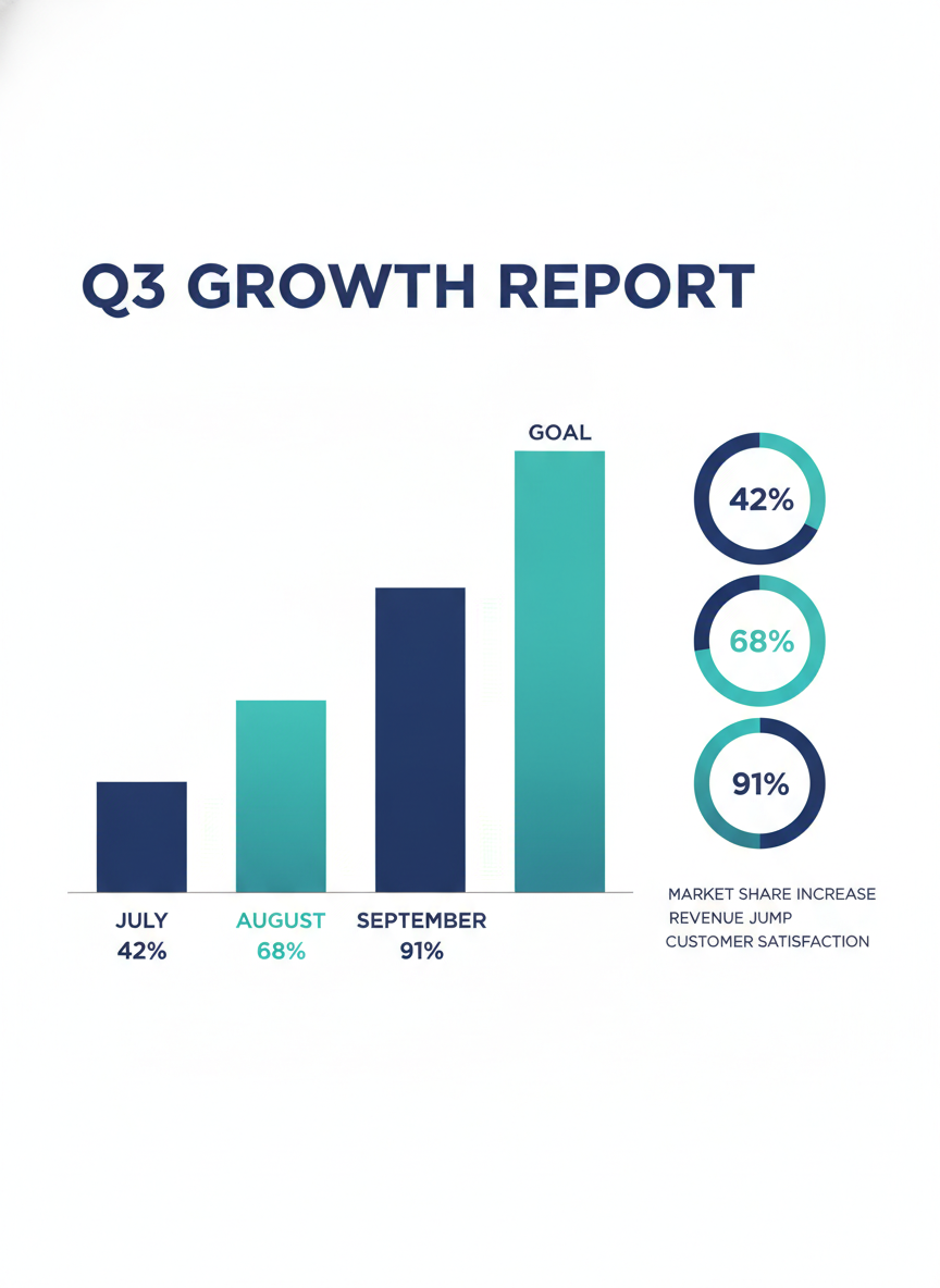
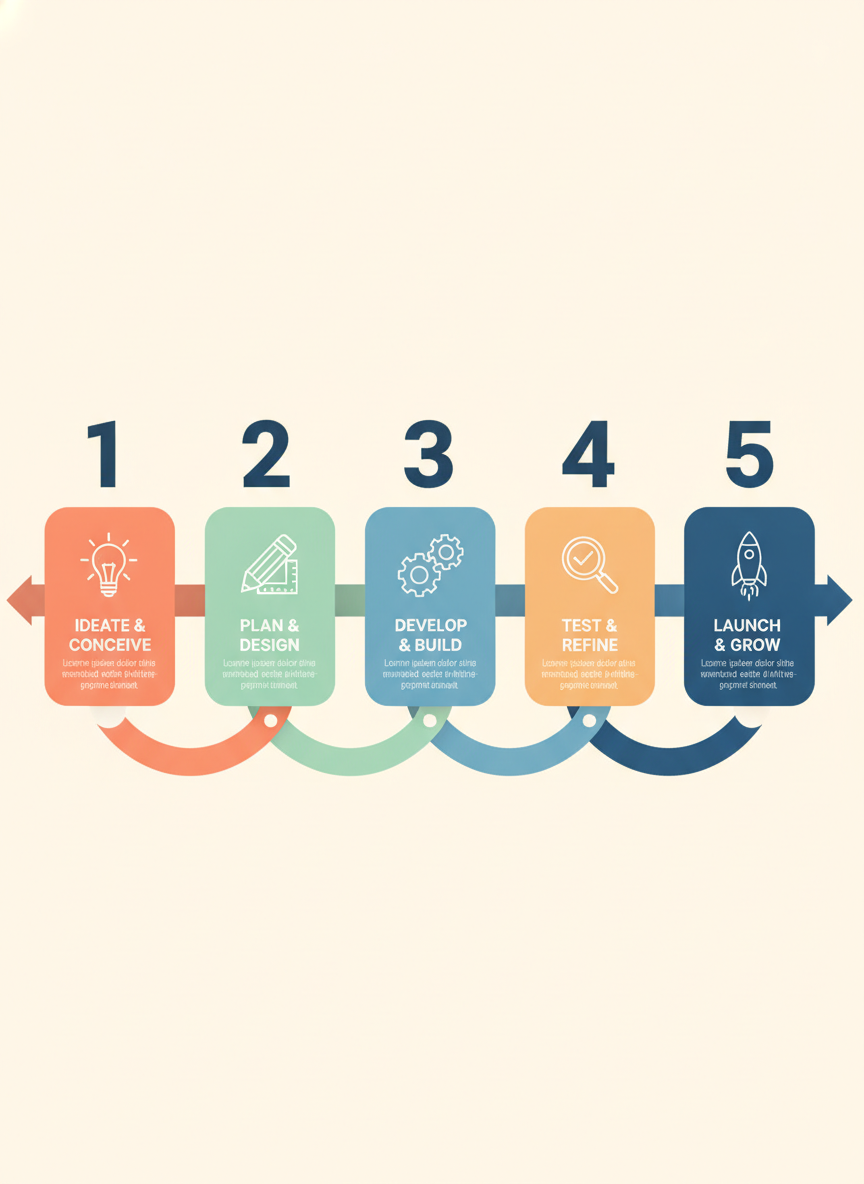
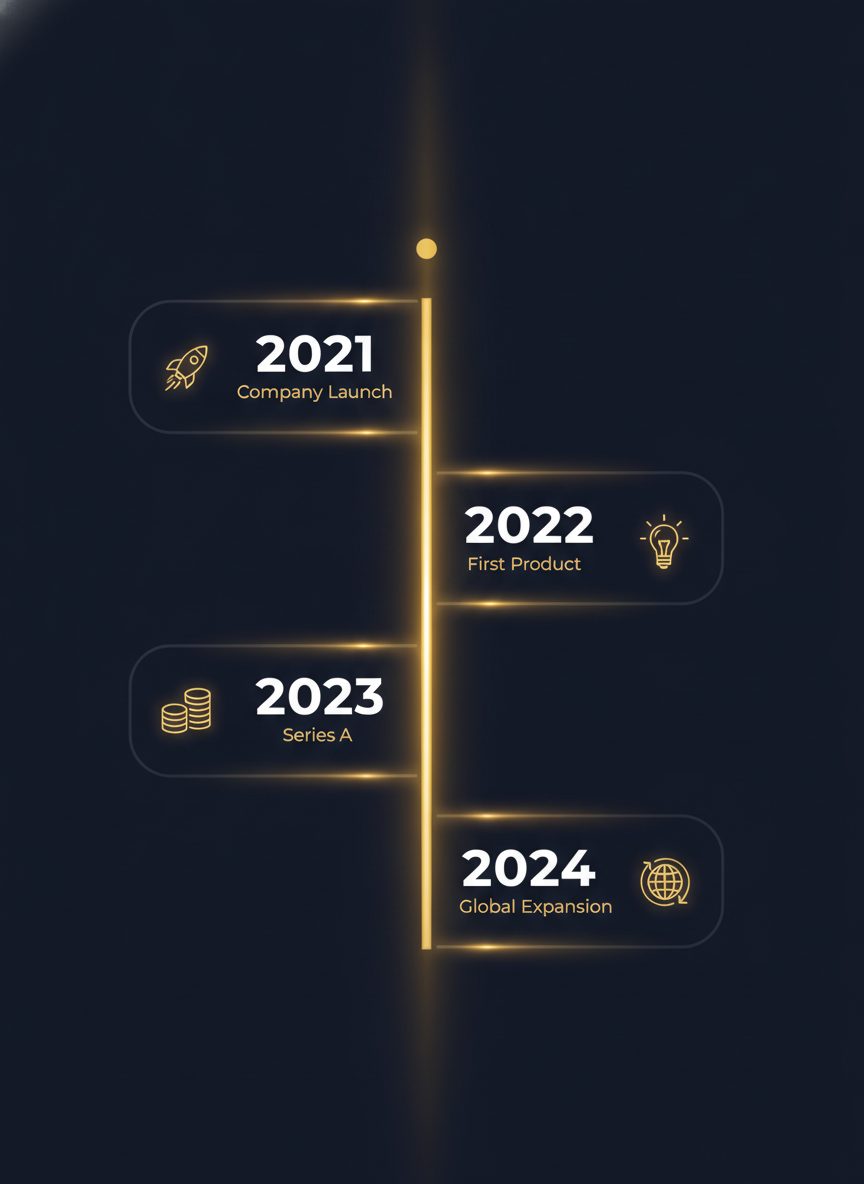
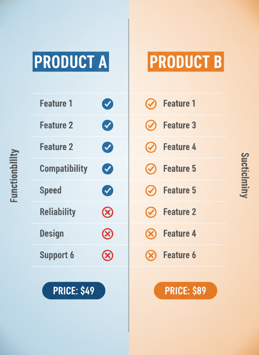
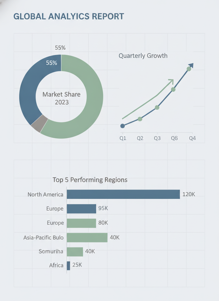
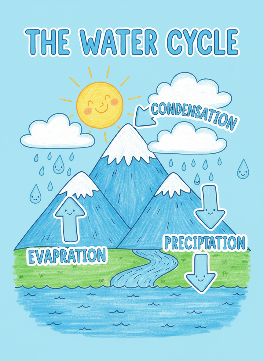
Business stats, process flows, timelines, comparisons, analyst reports and classroom posters — each one started as a couple of sentences
How the AI Infographic Generator Works
Three steps from a spreadsheet row to a graphic you can drop straight into a deck
Pick the Layout That Fits
The shape of your information decides the layout, not your taste. Quantities that need comparing want bars and stat rings; a sequence wants numbered process cards; anything with dates wants a timeline; two options want a split comparison; a mixed analysis wants the report layout with a donut, a trend line and a ranking. Each preset is a full design brief covering palette, spacing, grid and type weight, so the six choices produce genuinely different documents rather than recolored versions of one.
Type In Your Real Numbers
This is the step people skip, and it is the one that matters. Put your actual title, your actual figures and your actual labels into the details box, wrapping exact strings in quotation marks. Because Nano Banana Pro renders readable text, "Q3 Growth Report", "42%" and "Onboarding" come back as those exact words instead of the letter-shaped noise other models produce. Name your brand colors here too and the whole graphic is built around them.
Generate, Check, Download
Your infographic arrives in roughly twenty seconds at up to 4K, watermark-free and cleared for commercial use. Read every label before you ship it — an AI infographic generator composes a picture of a chart rather than plotting your data, so treat the numbers as text you supplied and proofread them like a designer would. Regenerate for a different arrangement, then drop the winner into a deck, a report, a blog post or a print run.
Why Teams Choose This AI Infographic Generator
Six reasons the output looks like design work rather than a chart-shaped smudge
Text You Can Actually Read
An infographic is a typographic object. Strip out the headline, the axis labels, the percentages and the step numbers and nothing is left but decoration. Nano Banana Pro renders legible type, which is the single reason this tool works for data graphics at all. Put your exact strings in quotation marks and they are painted as letters, not as the plausible-looking gibberish that makes most AI charts unusable in a real document.
Six Layouts, Six Real Jobs
Business stats for a quarterly update. Process steps for onboarding or a how-to. Timeline for company history, roadmaps and project phases. Comparison for pricing pages and competitive tables. Data report for analyst-style mixed visualization. Educational for classroom and explainer posters. Each preset carries its own grid, palette and typographic hierarchy, so you are choosing a document type rather than a filter.
Your Brand, Your Palette
Name your colors in the details box — hex values, brand names, or plain descriptions like deep navy with a warm coral accent — and the layout is built around them instead of the preset default. That is usually the difference between a graphic you can put in a client deck and one that visibly came from a stock template. Add your typographic tone the same way: authoritative and dense, or airy and friendly.
Twenty Seconds Per Draft
The reason infographics get skipped is the hour they normally cost. At roughly twenty seconds a draft you can try the same content as a timeline, a process flow and a stat block, put all three in front of a colleague, and still be finished before a design tool would have opened. Fast iteration also changes what you attempt — you stop rationing graphics and start making one for every section that deserves it.
4K Export, Print-Ready
Graphics export at up to 4K with no watermark and full commercial rights. Resolution matters more for infographics than for almost any other image type, because the smallest element is text: a legend, a source line, an axis tick. At 4K those survive a conference poster, an A3 handout or a full-width blog hero. Downscaled output would blur exactly the labels that carry the meaning.
Free to Start, $9.98 to Scale
Run the layouts free with no credit card and see how your content behaves before spending anything. Paid plans start at $9.98 when you need volume — a full report with a graphic per section, a lesson series, a pricing page refresh across every tier. That is a fraction of one freelance design hour and less than a month of most subscription infographic makers, with no seat minimum attached.
Frequently Asked Questions
Common questions about using an AI infographic generator
Turn Your Data Into Something People Actually Read
Charts, timelines, process flows and comparison tables in 4K with legible labels — no design tool, no template hunting, no waiting on a designer. Powered by Nano Banana Pro. Free to start, plans from $9.98.
Charts, Timelines and Data Graphics With an AI Infographic Generator
Infographics are the first thing cut from a document and the last thing anyone regrets adding. The reason is always time: a decent data graphic means opening a design tool, fighting a grid, hunting a template that nearly fits, and losing an hour to alignment before a single number is on the page. An AI infographic generator collapses that hour into a sentence. You say what the graphic has to communicate and which shape suits it, and twenty seconds later you have a composed 4K page with a headline, a chart, labels, icons and a palette that hold together as one design.
What makes this specific tool workable for data graphics is text rendering. Every other capability is secondary. An infographic without readable labels is not a weaker infographic, it is not one at all — a bar chart whose axis reads as approximate letterforms cannot go in a deck, a report, or a classroom. Nano Banana Pro renders genuine type, so quoted strings in your prompt come back as those characters: the title you wrote, the percentages you supplied, the step names in your process. That one property is what moved AI-generated infographics from a novelty into something you can put in front of a client.
The six layouts map onto the jobs infographics are actually hired for. Business stats for quarterly numbers and launch recaps, built on bars and percentage rings. Process steps for onboarding, how-tos and recipes, laid out as numbered cards along an arrow. Timeline for history, roadmaps and phases, running down a spine with alternating milestones. Comparison for pricing and competitive tables, split down the middle with checks and crosses. Data report for the analyst look, combining a donut, a trend line and a ranking under one grid. Educational for classroom posters, drawn friendly and labeled large.
From Pitch Decks to Classroom Posters
The people getting the most out of an AI infographic generator are the ones who need graphics constantly and have no designer on call. Founders assembling investor updates the night before a meeting. Marketers who want a carousel per blog post instead of one hero image. Analysts turning a dense findings section into something a stakeholder will look at. Teachers building a poster per unit. Consultants who need a comparison table that looks considered. Product managers documenting a roadmap. In each case the alternative was not a better graphic — it was no graphic, or a screenshot of a spreadsheet.
Getting a good result comes down to writing the brief a designer would ask you for. Supply your real content rather than placeholders, and quote exact strings so the model treats them as text to set. Keep every label short, because dense paragraphs inside a tight layout are still the hardest thing to render cleanly. Name your palette explicitly, in hex or plain description, and the whole page is built around it. Say who the audience is — a board, a classroom, a landing page — since that shifts density, type size and tone more than any style word. Then generate the same content in two layouts and let the comparison tell you which shape your information actually wanted.
One honest limitation, worth repeating because it decides how you use the tool: this is a generator, not a plotting library. It draws a convincing picture of your data rather than computing it from a file, so the visual proportions illustrate your story instead of measuring it. Proofread every figure before it ships, and for anything that must be exact to the decimal, chart it properly and use this for the surrounding material. Within that boundary, everything you make is yours — 4K, watermark-free and cleared for commercial use. The AI infographic generator is free to begin with no credit card, and plans start at $9.98 when you want a graphic for every section.
Try the AI infographic generator free today. Turn your numbers into 4K charts, timelines, process flows and comparison tables with labels that actually read. No credit card required to start. Paid plans from $9.98.